What happens when no one knows where the recipe lives?
KitchenThread wasn’t built to digitize workflows
It was built to solve the everyday kitchen friction
“Where do we keep the recipe — and how does everyone find it when they need it?”
This is the story of how I designed for the people behind the prep — told through the voices of those who live it.
Role:
UX designer for a mobile recipe and task manager, turning scattered chef notes into a shared source of truth.
Timeline:
3–4 week concept project
Solo designer with feedback from chefs
Impact:
Gave the team one place for core recipes, tasks, and notes, reducing “where is this?” confusion during service.
PROBLEM & CONTEXT
📖 The Problem Wasn’t the Recipe — It Was Finding It
We had the steps. We didn’t have the system.
“
It’s in my notebook — I think I wrote it down last month.
"
One place for all recipes
“
I had to ask the chef again because I wasn’t sure of the method.
"
Easy to reference the correct version
“
I didn’t even know I was responsible for that step.
"
Clear ownership of recipe access
FLOW & INFORMATION ARCHITECTURE
🥣 How the Flow Came Together
"No paths. Just what actually needed to happen."
The problem wasn’t where the recipe was stored — it was how people reached it, what they expected to find, and what got in their way. So I stopped thinking in screens and started thinking in steps. What did they need first? What confused them most? I laid everything out — flow, friction, and content — and began grouping what made sense together.
What needed to happen — from moment of prep to plate.
Grouped what mattered. Dropped what didn’t.
EXPLORATION & WIREFRAMING
🍽️ The Sketches Weren’t for Style — They Were for Sanity
Structure before style — just enough to test it.
I didn’t sketch to impress. I sketched to debug. After sorting the ideas, I needed to see if the flow felt natural — if users could glance, scroll, and get it. These weren’t designs. They were sanity checks.
What I thought might work
What was ready for feedback
USABILITY TESTING & ITERATIONS
🥄 What I Tested, What I Changed
The friction points that shaped the final design
Think- aloud congnitive walkthrough
Task 1 –Locate your assigned step.
Task 2 – Reply to an existing note from a teammate.
Task 3 – Start creating a new recipe.
Task 4 – Assign Step 2 to a team member..
Task 5 – Use the Procedure tab and explain what you’d do first.
Task 6 – Leave a note: “Start prep the night before.”
Insights
Users struggled to locate their assigned step quickly and had to scroll extensively to find it.
Some users weren’t sure who the team members were and hesitated to assign tasks without knowing their roles.
Notes were often mistaken for static instructions rather than a space to add or read multiple comments.
Users got confused as didn’t know how many steps were in the procedure or how to reach the next section.
Assigning a step felt disconnected from the overall schedule — users didn’t know when the recipe would be served.
Users assumed notes were read-only — the reply option wasn’t visually obvious.
FINAL DESIGN & OUTCOME
🍳 The Recipe Was Finally Ready — And It Just Worked
Insight → Enhancement Table
Assigning a step felt disconnected from the overall schedule — users didn’t know when the recipe would be served.
Added inline “Serving Time” context within the assignment screen so users could assign more meaningfully.
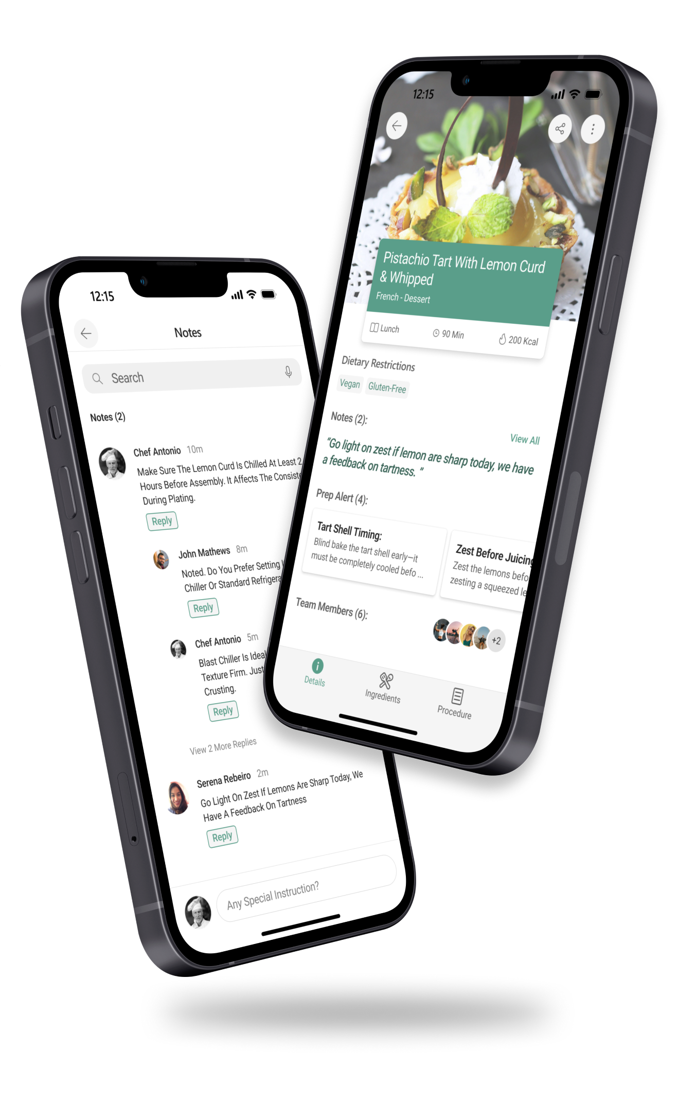
Users assumed notes were read-only — the reply option wasn’t visually obvious.
Made reply action clearly visible with reply buttons, indentation for threads, and active text input cues.
Users got confused as didn’t know how many steps were in the procedure or how to reach the next section.
Added step indicators and used inline prompts + a clear next-step CTA.
Some users weren’t sure who the team members were and hesitated to assign tasks without knowing their roles.
Introduced role labels and context tags (e.g., Prep, Pastry, New Staff) beside member names in the assignment flow.
Notes were often mistaken for static instructions rather than a space to add or read multiple comments.
Added note count, “View All” link, styled notes as comments, and visually separated system alerts from user inputs.
Users struggled to locate their assigned step quickly and had to scroll extensively to find it.
Added a “Jump To” menu that lets users navigate directly to their assigned step or any specific step in the procedure.
CONCLUSION & WHAT'S NEXT
🧂 What I Took Away
Here’s where it’s going now.
Closing Thought
This project taught me that clarity is often more powerful than complexity. Most of the design changes weren’t about adding new features — they were about removing the guesswork. Fast feedback cycles helped me spot friction early and act on it without overthinking. The result? Team members could finally follow recipes, leave notes, and complete their assigned steps without hesitation. One participant put it simply:
“This just makes things easier — I don’t have to think twice anymore.”
What’s Next?
I’d explore a “delayed step” flag that auto-notifies the next person in line.
I’d connect recipes to live inventory so chefs see ingredient availability without switching apps.