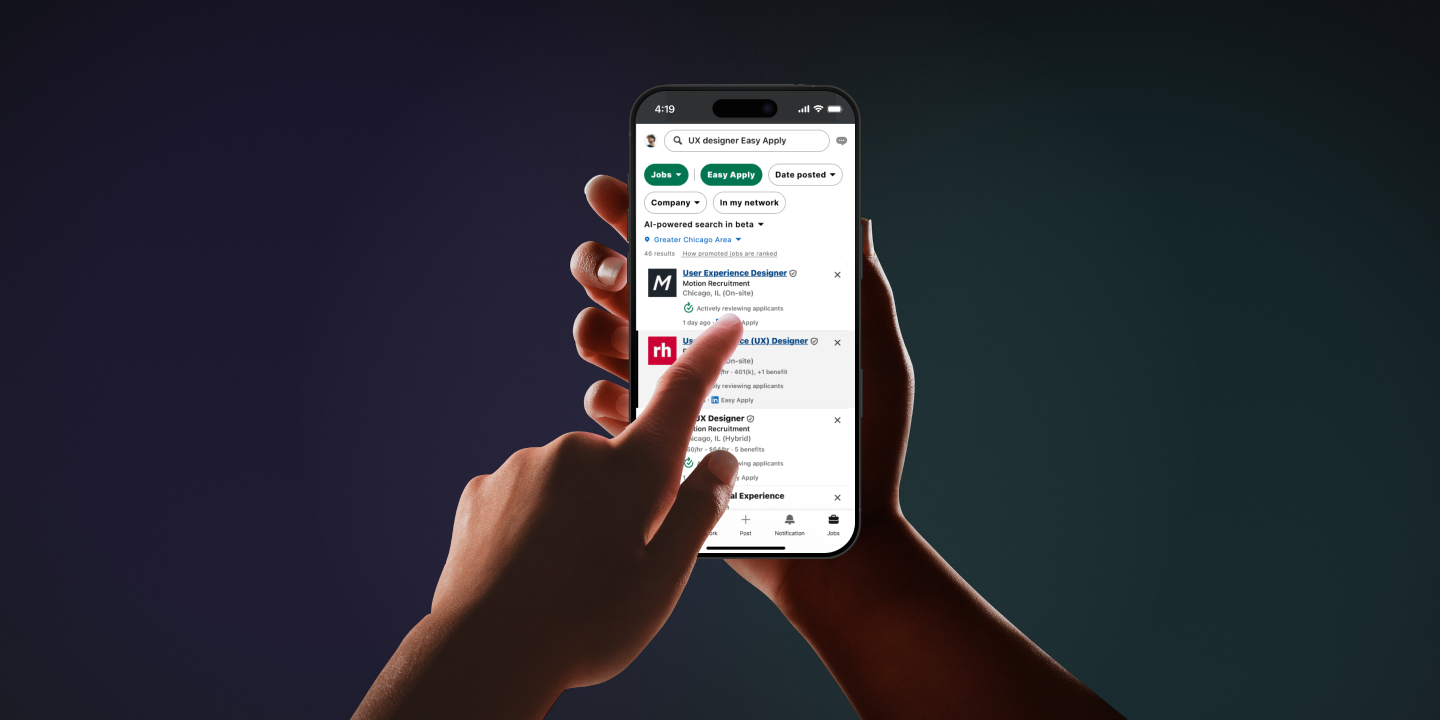
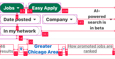
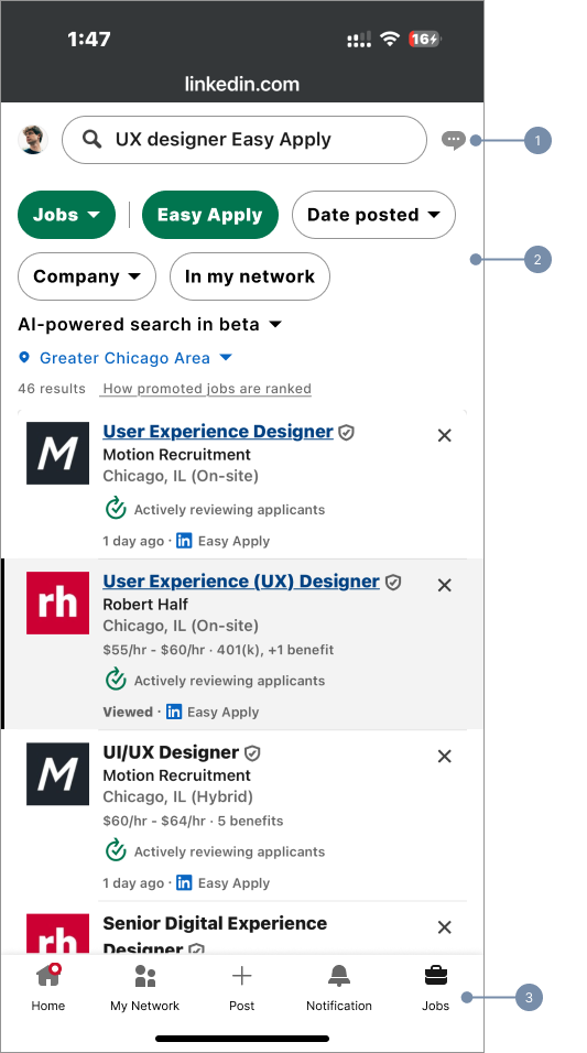
LinkedIn - Accessibility Fixes

Let AI detect — you decide what stays.
I recreated LinkedIn’s mobile-first jobs UI and brought five core components up to WCAG—fixing low-contrast borders and undersized tap targets —without changing the visual feel.
I used a simple loop—checklist → tokens → apply → verify—to make it safer to see, tap, and navigate.
Contrast ≥ 3:1
WCAG 1.4.11
Target 44×44
WCAG 2.5.8
Structure rhythm
WCAG 1.3.1
Reflow / Wrap
WCAG 1.4.10

Challenge

The Web Content Accessibility Guidelines (WCAG) require that:
  • Visual information used to identify UI components and their states have a contrast ratio of at least 3:1 (except for inactive components or when the component is determined by the user agent)
    WCAG 2.5.8
  • Pointer targets be ≥ 24×24 CSS px or have equivalent spacing, kept clear of platform gesture areas like the iOS home indicator
    WCAG 2.5.8
  • Information and relationships be conveyed consistently in both visual layout and programmatic structure
    WCAG 1.3.1
  • Content reflow at 320 px width / 400% zoom without loss or two-directional scrolling.
    WCAG 1.4.10
Role:
Accessibility UX Designer
Time:
48h
Tools:
Figma, Stark

Process

Understanding WCAG 1.4.11

Low-contrast borders and state icons are easy to miss for people with low vision. People should not need contrast-enhancing tools to perceive and understand UI.
Non-text contrast
Any visual information needed to identify the input boundary and its state must have a minimum 3:1 contrast with adjacent colors; measure the border stroke against the surface it sits on (disabled states may be exempt)
Affected
Search border
Chip outline
Finding
  • Search border1.71:1 ( #C6C6C6 ↔ ▢ #FFFFFF )
  • Chip outline1.57:1 ( #CECECE ↔ ▢ #FFFFFF )
Search bar with border contrast increased from 1.71:1 to 3.03:1

Understanding WCAG 2.5.8

Small or tightly packed targets force precision taps for motor and large-finger users. People shouldn’t need to zoom or retry to activate controls.
Target size
Any pointer target must be at least 24×24 CSS px or spaced so it’s equivalently easy to hit; on mobile we ship 44×44. Keep effective targets clear of platform gesture areas.
Affected
Search
Chips
Finding
  • Search hit area37 px
  • Chip hit area — 35 px
Filter chip with 35 px height vs 44×44 target overlay

Understanding WCAG 1.4.10

Layouts that don’t reflow hide or split content for zoom and small-screen users. People shouldn’t have to pan sideways.
Reflow at small width
At 320 px / 400%, the page scrolls only vertically and nothing is lost; when content wraps, it stays on-grid with a single left rail and predictable gaps
Affected
Filter strip
Info cluster
Page container
Finding
  • Page containerHorizontal scroll at 320 px
    • Filter strip
      • Container insets —  L = 0 / R = 145 px
      • Row gap  —  8 px
    • Info cluster
      • Container insets —  L = 0 / R = 7 px
      • Row gap  —  20 px
      • Location icon ↔ label  —  17 px
      • Label ↔ link  —  14 px
Filter strip at narrow width wrapping with 16 px insets and 12 px gaps.

Understanding WCAG 1.3.1

Inconsistent insets/gaps break perceived grouping for everyone and confuse assistive tech. People shouldn’t have to re-parse ad-hoc layouts.
Information & relationships
Information, structure, and relationships conveyed visually must be consistent and programmatically determinable. Use equal columns, stable insets, and predictable gaps.
Affected
Search row
Chips cluster
Bottom bar
Finding
    • Bottom bar
      • Icon ↔ label —  6 px → 8 px
      • Inter-item spacing (centers) —  27 / 33 / 31 px
    • Search row
      • L/R insets —  16 / 40 px
      • Avatar ↔ Search —  28 px
      • Search ↔ Message —  22 px
    • Chip cluster
      • Chip–chip gaps (columns)—  8.5 / 9.5 px
      • Row gap —  8 px
Bottom bar with equal 88 px columns, 8 px icon–label gap, 34 px safe area.

Solution

1
Search row
  • Border contrast3.03:1
    1.4.11
    ( #949494 ↔ ▢ #FFFFFF )
  • Tap target44 px
    2.5.8
  • Layout
    1.3.1
    • L/R insets —  16 / 16 px
    • Neighbor gaps —  12 / 12 px
2
Filter strip
  • Border contrast3.03:1
    1.4.11
    ( #949494 ↔ ▢ #FFFFFF )
  • Tap target44 px
    2.5.8
  • Reflow / structure
    1.4.10
    • No horizontal scroll at 320px
    • Container rails —  16 / 16 px
  • Info alignment
    1.3.1
    • L/R insets —  16 px
    • Icon ↔ Text —  8 px
    • Label ↔ Link —  12 px
3
Bottom bar
    • Layout
      1.3.1
      • Equal columns —  88 px (in 440 px)
      • Icon ↔ Label —  8 px

    Conclusion

    Bringing Search, Filter, and Bottom bar up to spec made the UI easier to see, target, and navigate.
    Metrics
    Contrast 3.03:1
    320 px — vertical only
    Targets ≥ 44 px
    Rails 16 / 16
    Gaps 8 / 12
    Bottom bar 5 × 88
    1.4.11
    1.4.10
    1.3.1
    2.5.8

    Learnings

    Measure > guess
    One fix → one WCAG
    Tokens = repeatable