A responsive web app for proactive instrument monitoring. It aggregates device health and alarms in one place so teams can scan, triage, and respond remotely—before issues impact uptime.
Role:
Drove UX and interaction design for an IoT remote care platform, creating reusable components (design system), defining alarm triage behaviors, and managing design delivery from prototypes to handoff.
Timeline:
3-4 weeks
Senior UX (Interaction Designer)
Team: End user, Product Owner, Engineers
Impact:
Improved scan-ability and alarm triage clarity across device monitoring—plus configuration UX to support consistent setup.
Challenge
Teams needed to proactively monitor client instruments and catch issues before uptime was impacted. But the existing experience wasn’t scan-friendly on the web—making it difficult to quickly spot problems, prioritize alarms, and take action remotely.
What made it hard:
Large device lists
Multiple alarms + changing states
Context needed before action
Shift handoffs
Process
Analysis of Existing Application
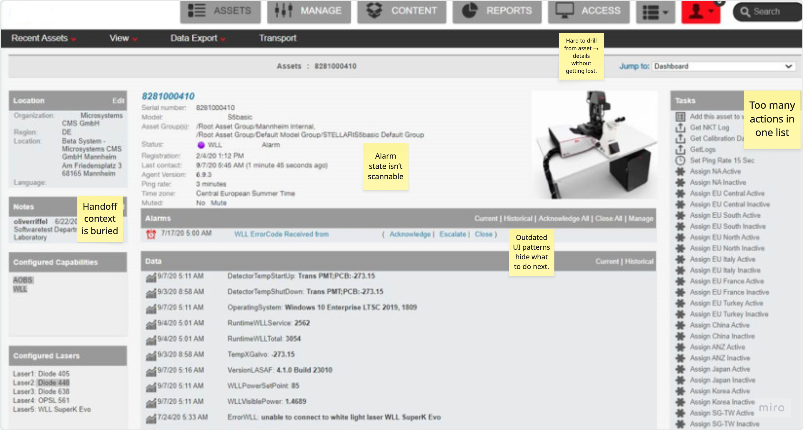
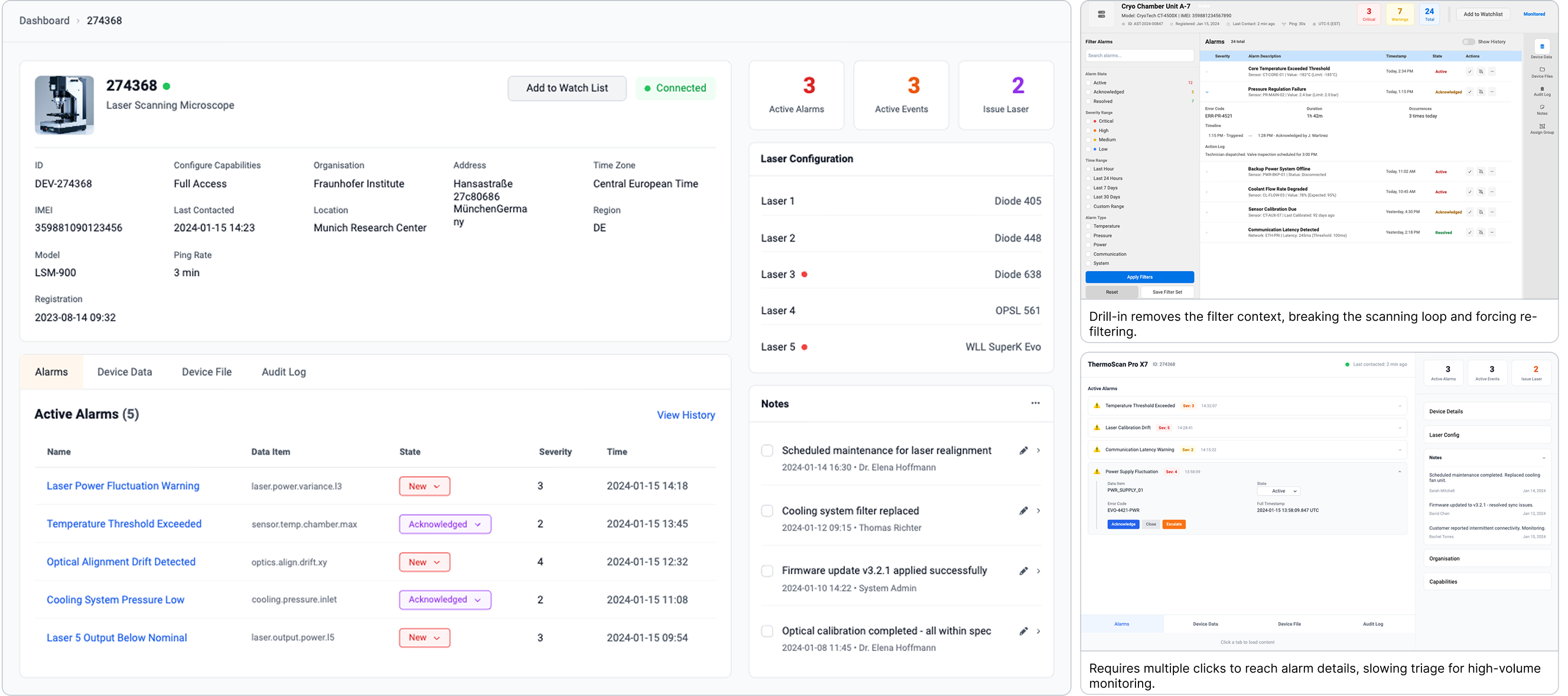
I started by reviewing the existing Single Asset details screen—the moment where monitoring teams need to quickly understand what’s wrong and what to do next. This helped me pinpoint the exact usability gaps before redesigning the experience.
Finding
Alarm priority isn’t obvious at a glance.
Primary actions are buried in a long list.
Notes/history are separated from the alarm moment.
Dense layout increases cognitive load and missed changes.
Navigation loses context and adds back-and-forth.
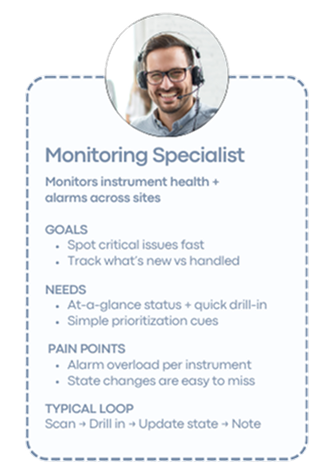
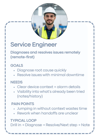
Quick Understanding of Users
With the baseline friction points clear, I aligned on how monitoring teams scan, prioritize, and hand off alarms day-to-day—so the redesign matched real “scan-and-act” behavior.
Finding
The UI must support two speeds: fast scan for Monitoring Specialists + deep context for Service Engineers.
Alarm triage needs a clear state model (New/Acknowledged/Closed) so “what changed” is instantly visible.
Single Asset view should act as a decision hub—context and next actions in one place.
Notes/History must be attached to the alarm moment to enable handoffs and prevent repeat work.
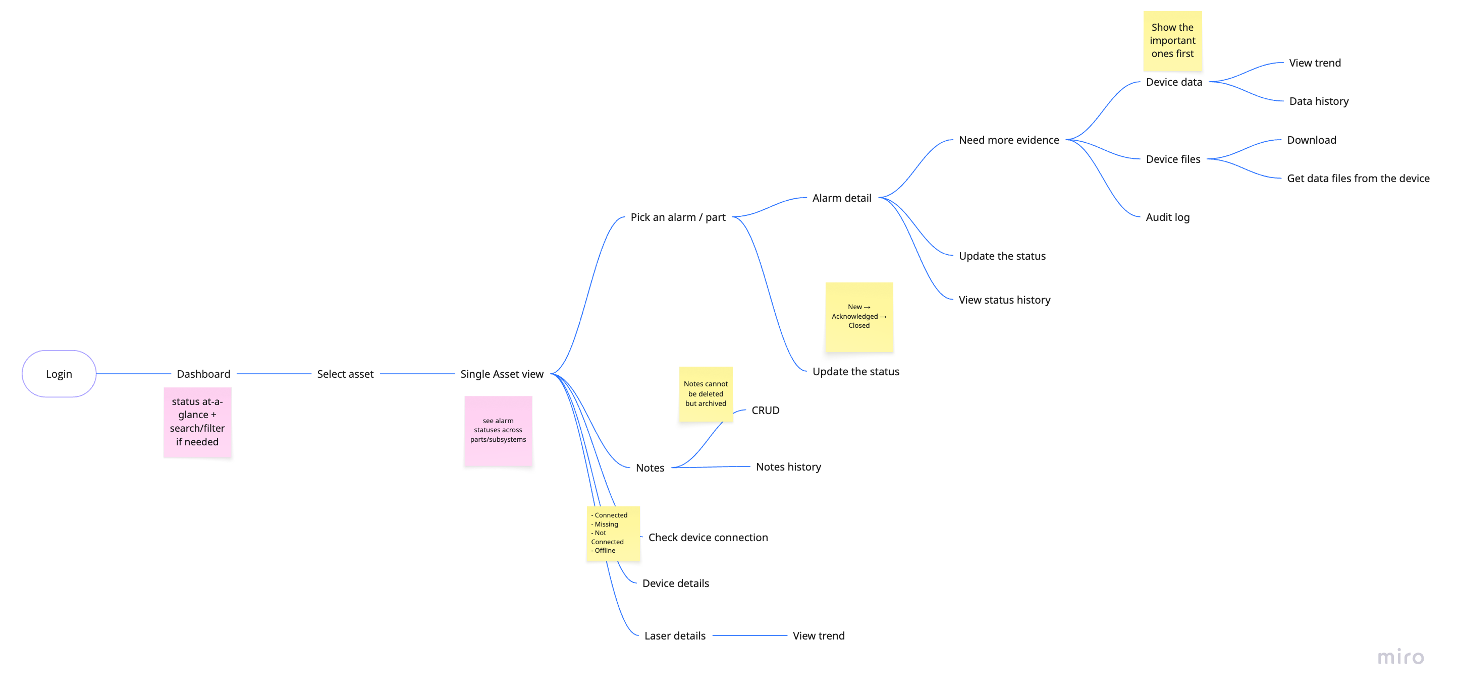
User Flow Mapping
With the baseline friction points clear, I aligned on how monitoring teams scan, prioritize, and hand off alarms day-to-day—so the redesign matched real “scan-and-act” behavior.
Finding
The flow confirmed the dashboard is for fast scanning, while Single Asset is where decisions and actions happen. It clarified what must remain persistent during drill-down (state, severity/time cues, and context). It helped me translate “scan → act → handoff” into concrete UI requirements for the next step.
Brainstorming
Next, I explored three structural concepts to improve multi-alarm triage—faster scan, clearer actions, better context.
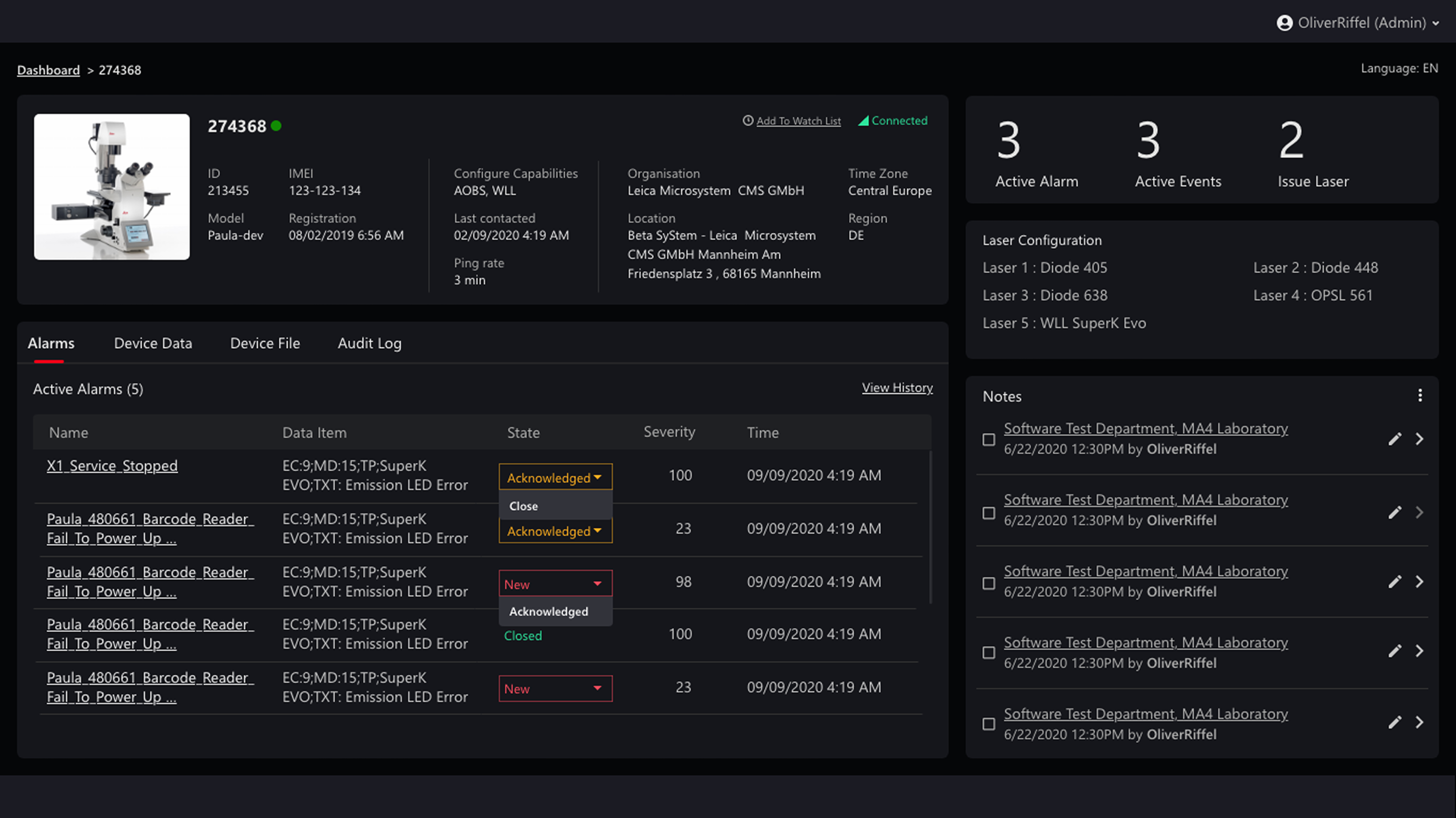
Solution
The platform required a centralized view capable of handling multiple simultaneous alarms without fragmenting context. The Single Asset layout consolidates prioritization, actions, and historical context into a unified decision surface.
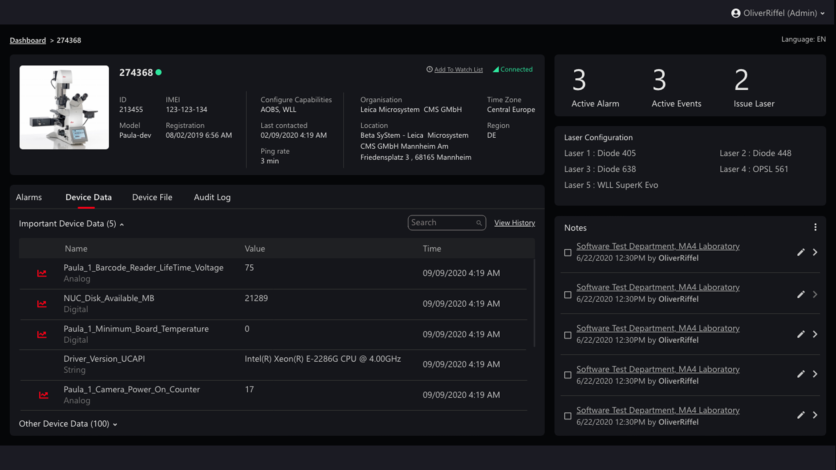
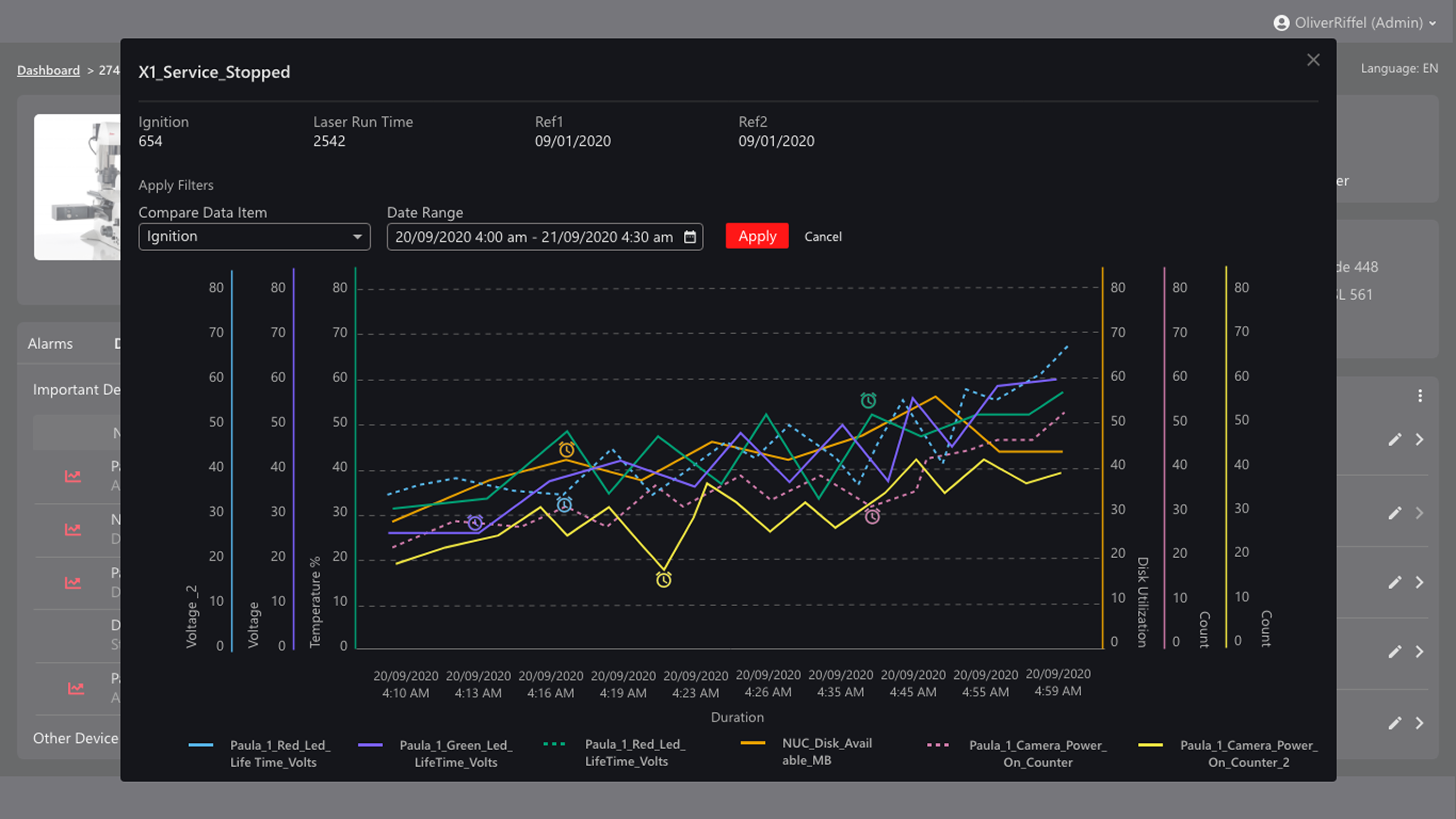
Device Data → Graph
Investigating device behavior required access to both high-level signals and detailed trend analysis. Separating summary data from an expandable graph ensures clarity at scale while preserving depth when needed.
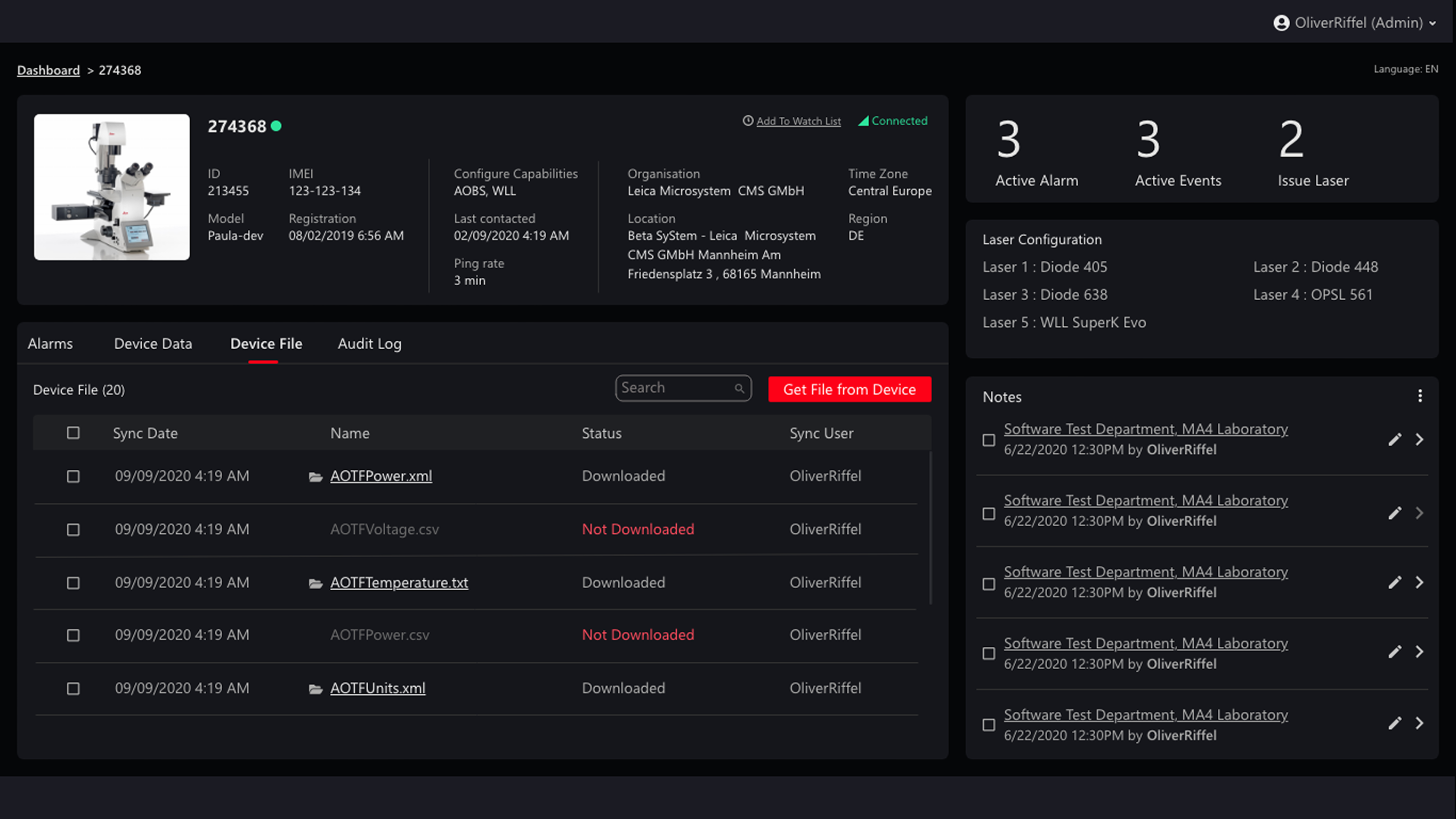
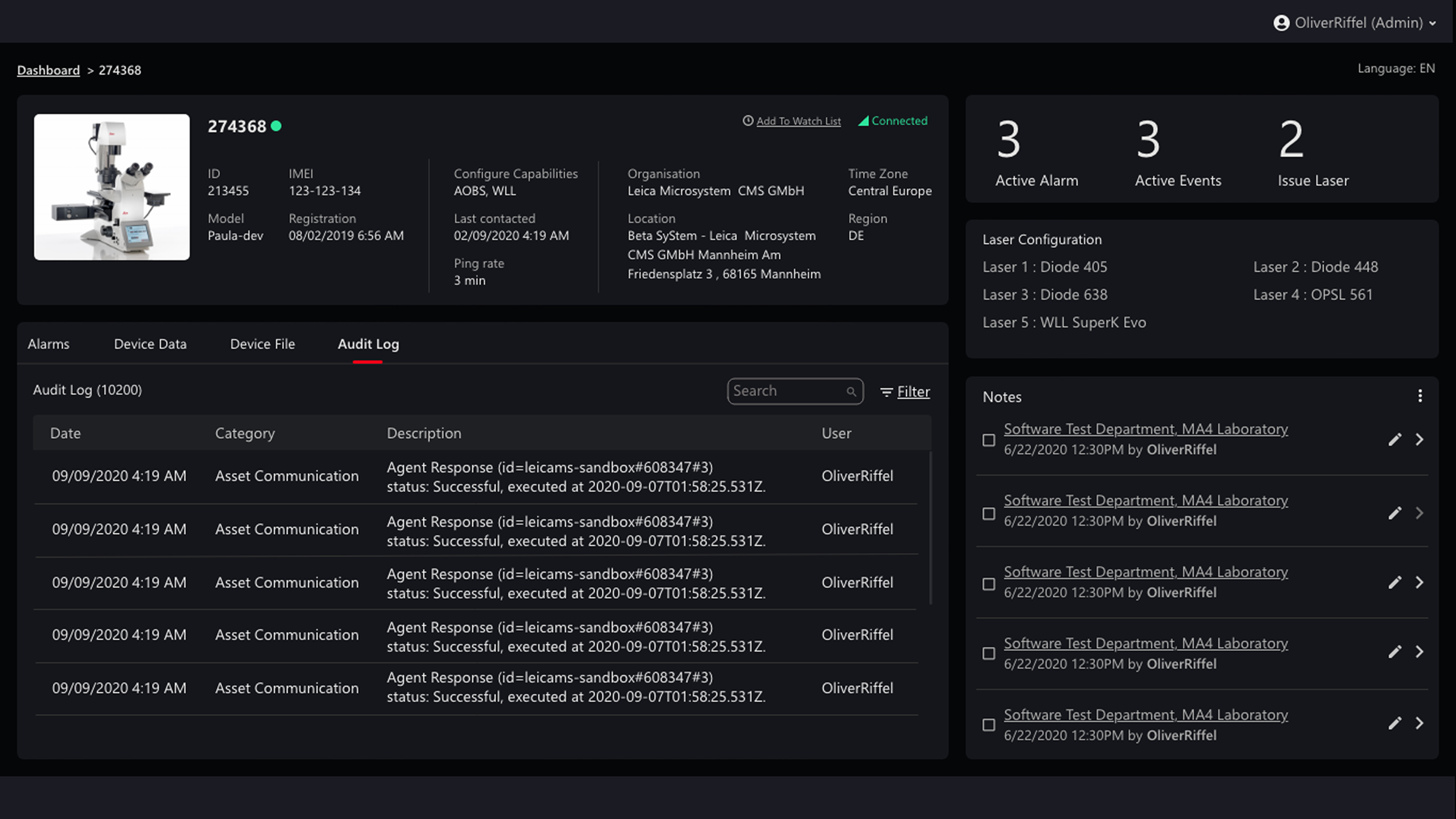
Device Files + Audit Log
Operational decisions depend on both data validation and traceability. Positioning file synchronization and audit visibility alongside core workflows reinforces system reliability and accountability.
What's next
Conduct usability testing to validate the triage flow under real-world pressure.
Measure decision time and cognitive load when handling multiple simultaneous alarms.
Refine visual hierarchy and severity cues to improve prioritization clarity.
Optimize information density for faster scanning in data-heavy views.
Takeaway
This project pushed me to think beyond individual screens and design at a systems level. It strengthened my ability to structure complex information, prioritize clarity, and create continuity across interconnected workflows—while keeping the user’s decision-making experience at the center.
%201.png)