Clinical Tracker Redesign

Helping clinicians spot what’s next—faster
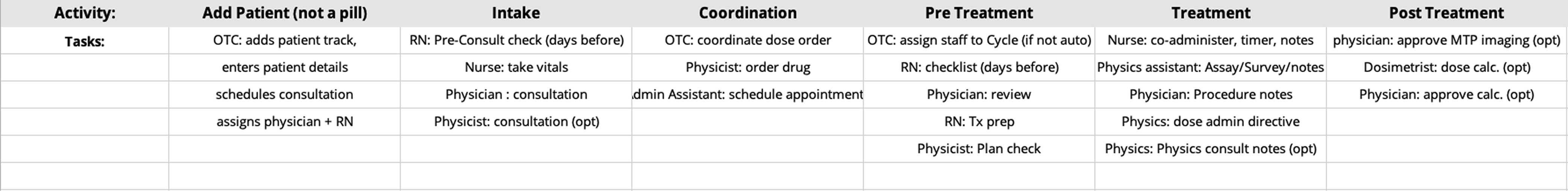
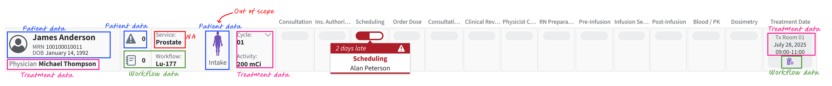
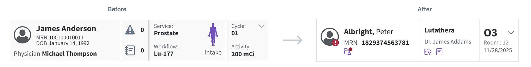
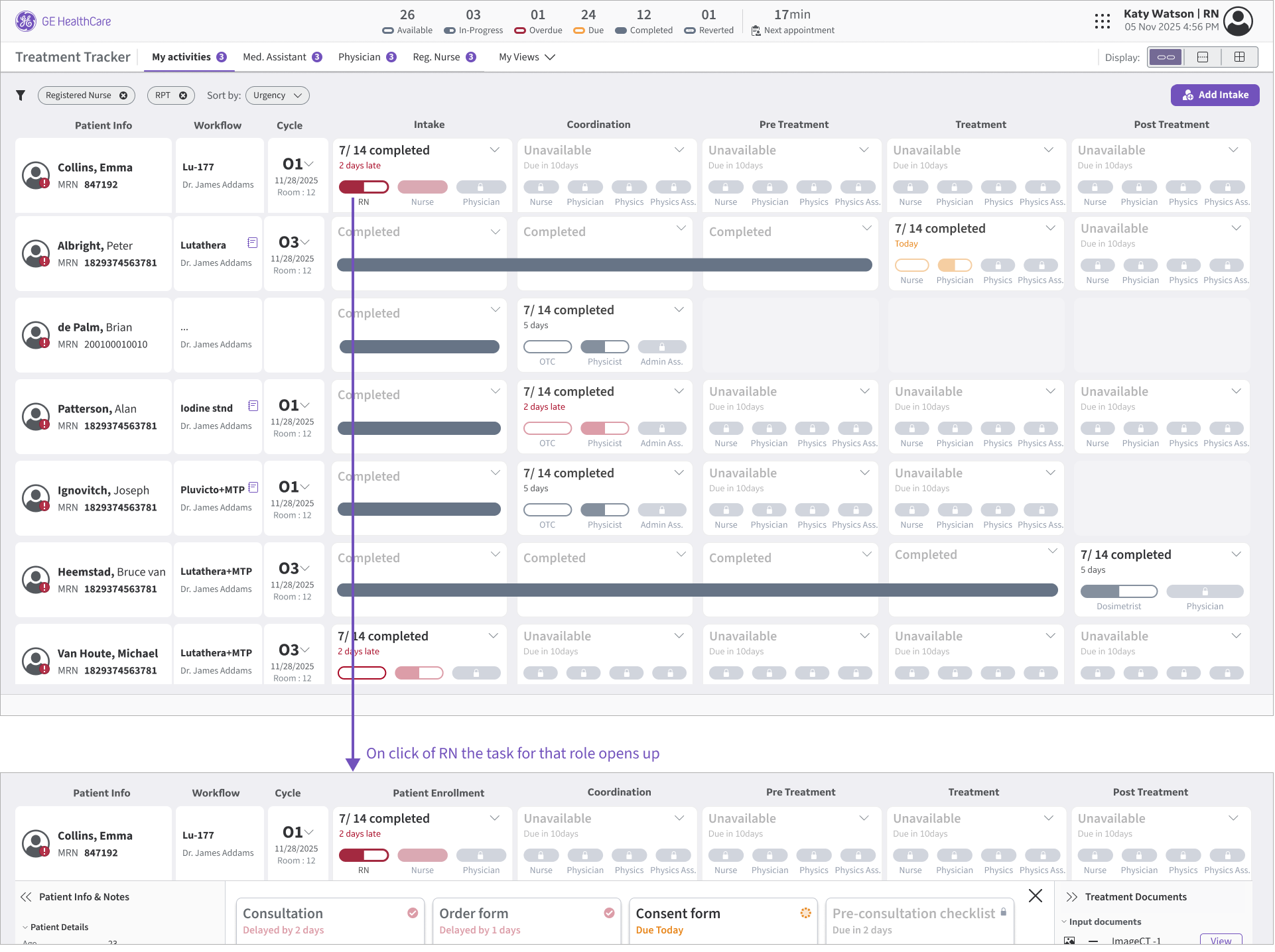
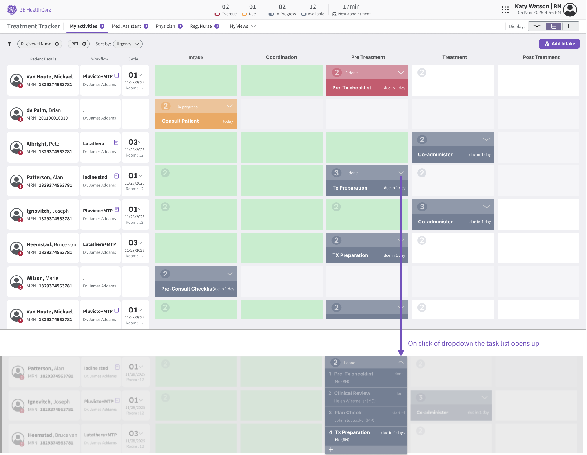
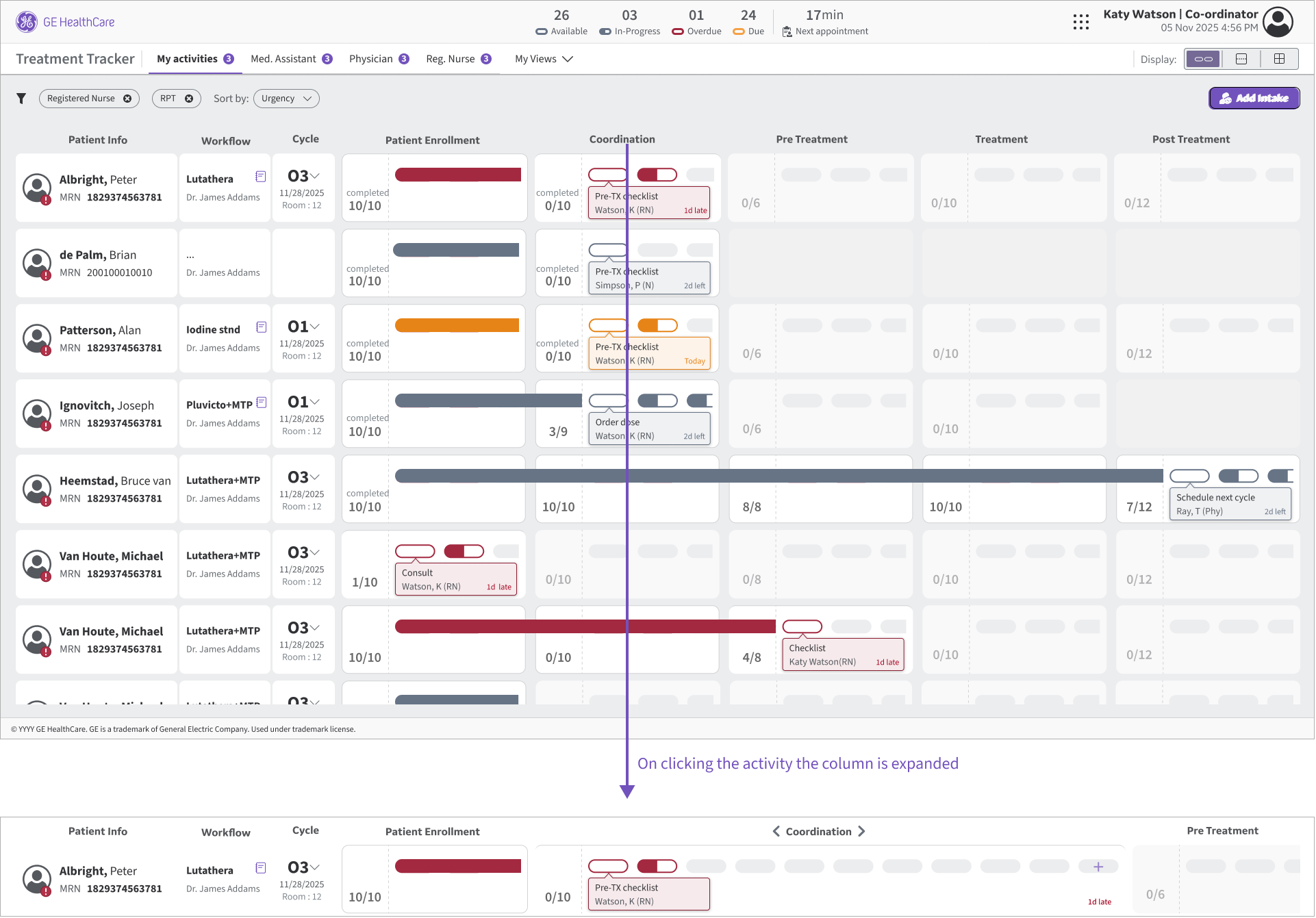
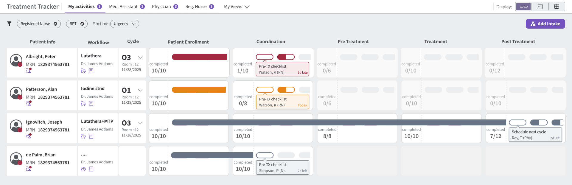
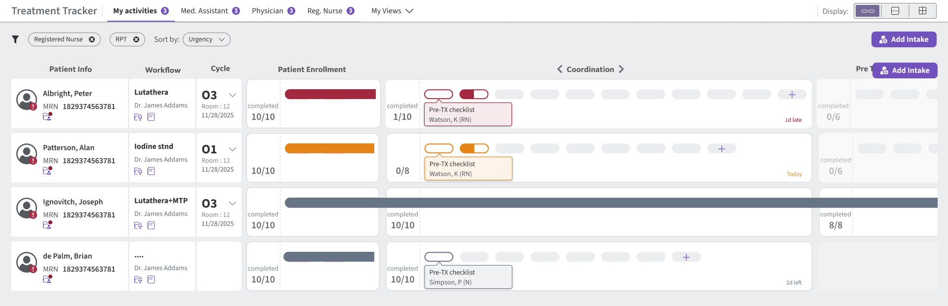
This is a clinical workflow application used by care teams to track a patient’s treatment journey end-to-end—planning, preparation, treatment delivery, monitoring, and follow-ups. The primary “racetrack” tracker view acts as a central hub, letting teams quickly scan what’s done, what’s pending, and what needs attention without jumping across multiple screens.
Role:
Ran alignment workshops, translated ambiguous requirements into feasible interaction patterns, and validated the preferred concept via quick A/B comparisons before delivering the prototype.
Timeline:
3-4 weeks
Usability Engineer (UX Designer)- GE Healthcare
Team: End user, Product Owner, Principal UX Designer, Engineers
Impact:
Enabled a flexible tracker model for radiopharma workflows, reducing unnecessary touchpoints and deep navigation in day-to-day tracking.

Challenge

As the application expanded from radiation workflows to radiopharma, the tracker had to support a much denser and more variable set of activities—without losing the scan-friendly racetrack experience.
  • Scale limit: The existing racetrack comfortably supported ~20–25 activities, while radiopharma workflows can require 40+ due to staricter monitoring and coordination.
  • Variability: Tasks differ across radiopharma organizations, so we couldn’t hard-code a single task list.
  • Must keep: Preserve the racetrack layout and keep it scannable while supporting configurable, customer-specific tasks.
As the application expanded from radiation workflows to radiopharma, the tracker had to support a much denser and more variable set of activities—without losing the scan-friendly racetrack experience.

Process

User Flow: Role-Based Workflow Map

I started by understanding how the process works in the hospital, then mapped it into the system by role—who uses the product, which tasks they access, and when those tasks happen in the journey.
This map revealed the full set of activities at a high level and helped me group them to fit within the existing racetrack model. I consolidated the workflow into 9 primary activity groups, each containing multiple tasks—so the tracker could scale without treating every task as a separate racetrack activity. In the UI, these underlying tasks are represented through the pill design within each activity group.

Layout Review: Racetrack Baseline

Step 1 — Audit the racetrack row
Journey from import to export with pain points highlighted.
Separate data types
Keep key identifiers visible; move secondary info out of the scan row.
Scattered information
Consolidate patient, workflow, and treatment info so the row stays scannable.
Prioritize tracker space
Give the most width to activities—this is the core scanning surface.
Step 2 — Recover space: Patient strip
Journey from import to export with pain points highlighted.
Freed space for activity scanning — 655px → 466px (+189px recovered), enabling more activities without reducing clarity.

Brainstorming

Exploration A

I first tried variations that stayed close to the existing racetrack to preserve familiarity—then documented why they wouldn’t scale.
A1. Status Pills
Limitation: Visually heavy; reduces scan speed as tasks grow.
A2. Circle Markers
Limitation: Requires hover/precision to understand progress, so it’s easy to miss.
A3. Status Cards
Limitation: Shows completion counts but hides which task is blocking.
A4. Nested tasks
Limitation: Adds a “UI inside UI” layer and becomes cluttered as tasks grow.
A5. Dot Track
Limitation: Scales in quantity, but individual tasks become hard to distinguish.
A6. Pills + Dots
Limitation: Collapses multiple tasks into one visual, reducing clarity and ownership.
A7. Line Track
Limitation: Too subtle at a glance; users may overlook urgency or meaning.
A8. Activity Cards
Limitation: Improves readability, but consumes too much horizontal space for scale.
Visual refinements helped, but none scaled cleanly past 40+ tasks—so I moved to structural concepts.

Exploration B: Structural concepts shortlisted for scale

Next, I explored three structural concepts to scale task visibility while keeping the racetrack scan-friendly.
B1 — Role-Based Pills
Idea: Group tasks under each activity by role so teams can complete role-owned work together.
Tradeoff: Cross-role dependencies are less visible, and reaching tasks still takes ~2 clicks.
B2 — Activity Blocks (Vertical list)
Idea: Reveal tasks vertically under each activity via a dropdown/stacked list.
Tradeoff: Changes the racetrack look-and-feel and feels less consistent with the current application.
B3 — Horizontal Task Expansion
Idea: Expand tasks horizontally under an activity for more direct access.
Tradeoff: Requires a click to expand, can push other activities off-screen, and still hits a horizontal scaling ceiling.

Quick A/B Comparison

Exploration B gave us 3 viable directions—but each traded off scan speed, familiarity, and task access. We compared them with users to confirm which concept could scale to radiopharma complexity without breaking the racetrack mental model.
Criteria
Role-Based Pills
Activity Blocks (Vertical list)
Horizontal Task Expansion
Scan-ability
Scales to 40+ tasks
Familiar to racetrack
Fast task access
Dependencies visible
Decision line: Chose Horizontal Task Expansion because it best balanced scan-ability + familiarity while improving task access (with controlled expansion).

Solution

State 1 — Collapsed (scan view)
State 2 — Expanded (work view)
Decision line: Chose Horizontal Task Expansion because it best balanced scan-ability + familiarity while improving task access (with controlled expansion).

Conclusion

From

A tracker built for radiation workflows—limited space, limited activities, and not designed for radiopharma’s 40+ variable tasks.

To

A scalable racetrack that keeps the familiar scan pattern, but introduces grouping + controlled expansion so tasks can grow without breaking the layout.

Where

A flexible foundation that different radiopharma sites can configure to match their process—without hard-coding task lists.

What's next

  • Validate with radiopharma users (scan speed + task find time).
  • Enable on-the-go task additions within an activity (e.g., “+ Task”).
  • Stress-test 40+ activities and long task names.
Kitchen Thread
Mobile UX | Role-Based Access | Lightweight UI

Coming Soon

Patient Scheduler
Usability | UX | CLINICAL WORKFLOW STRATEGY