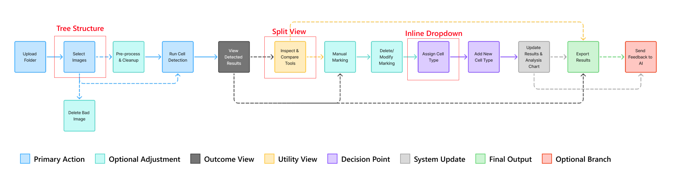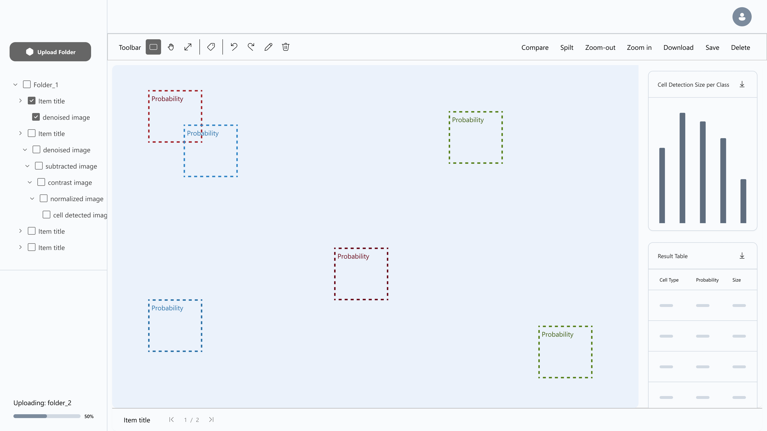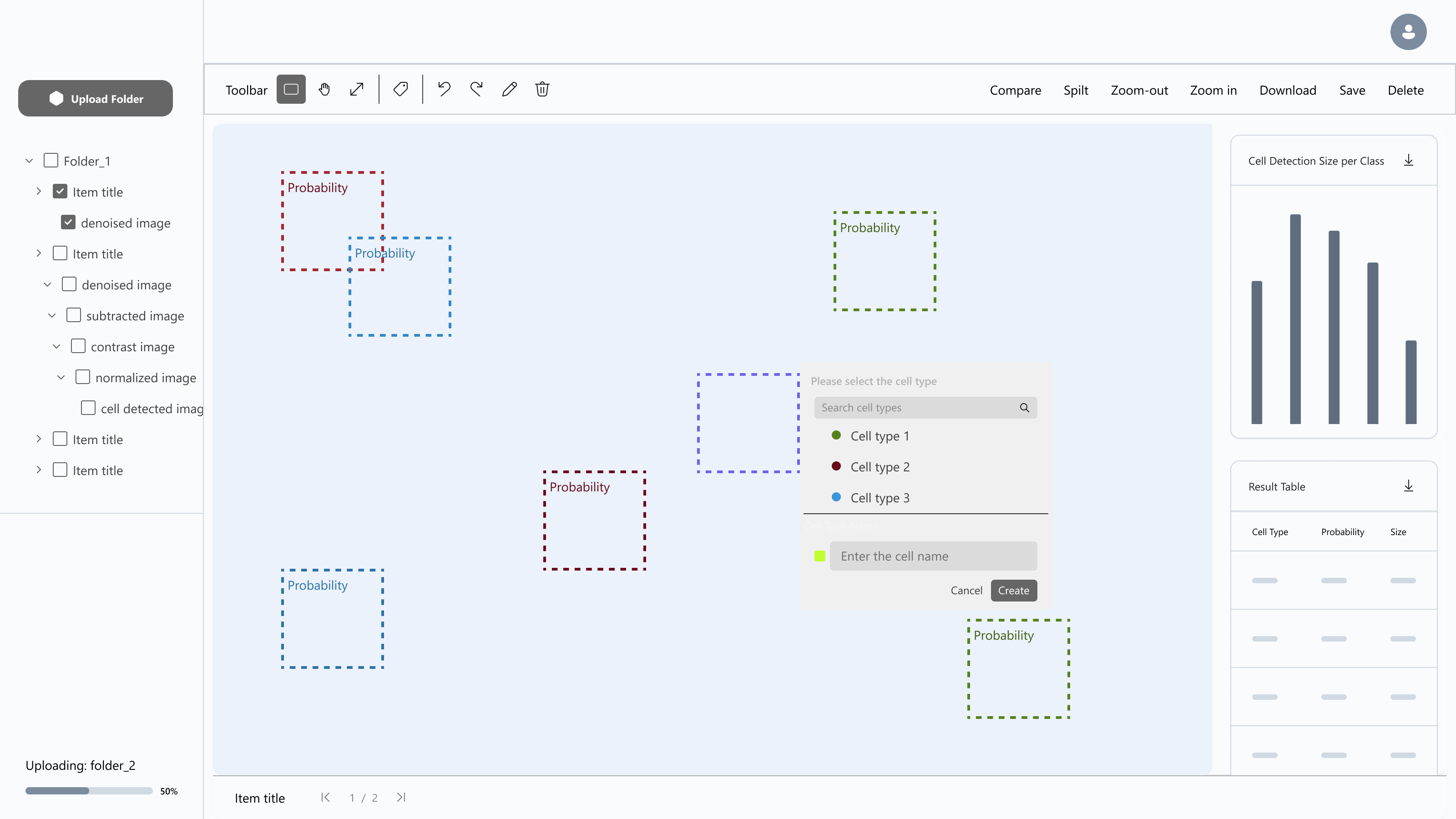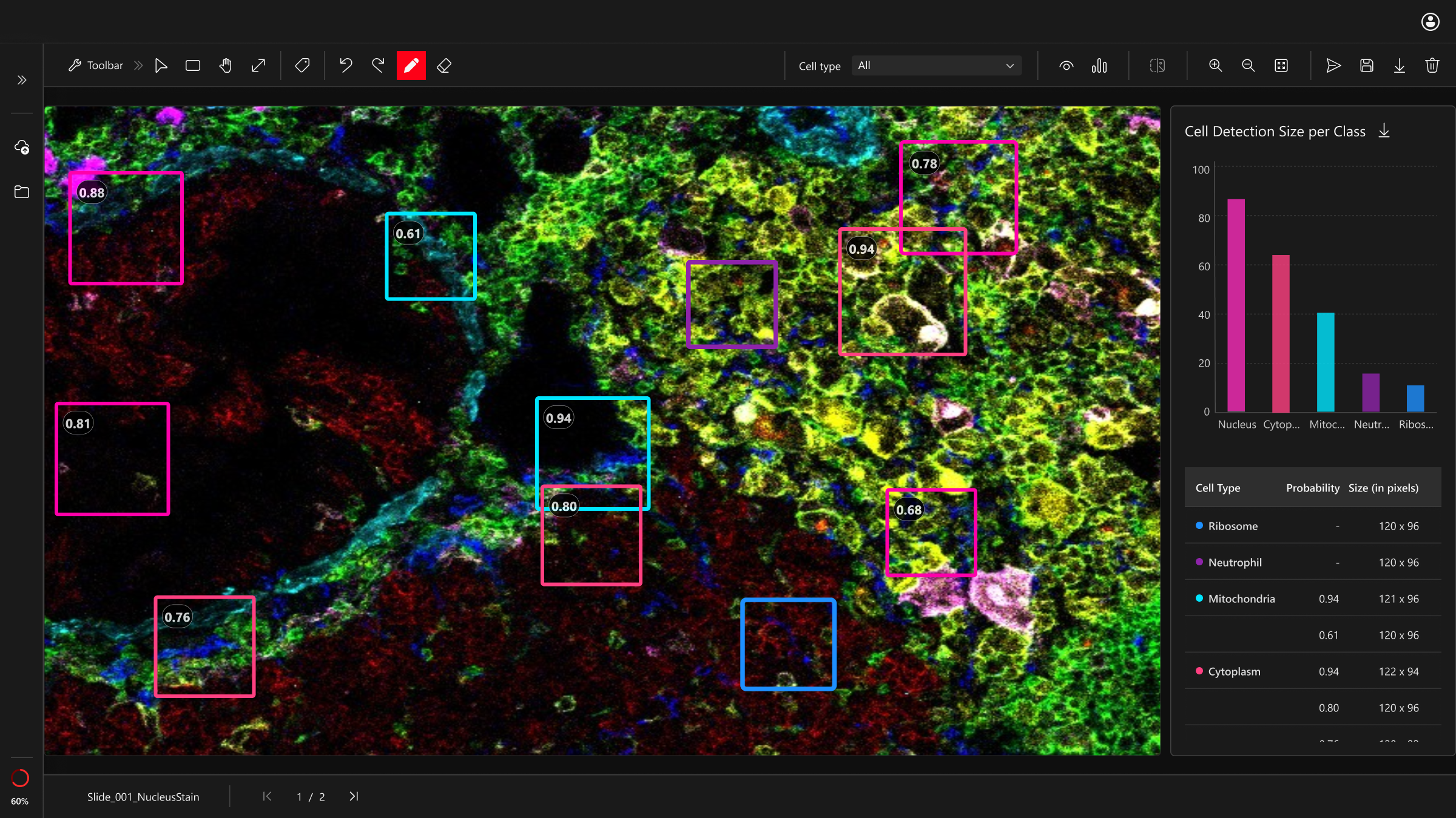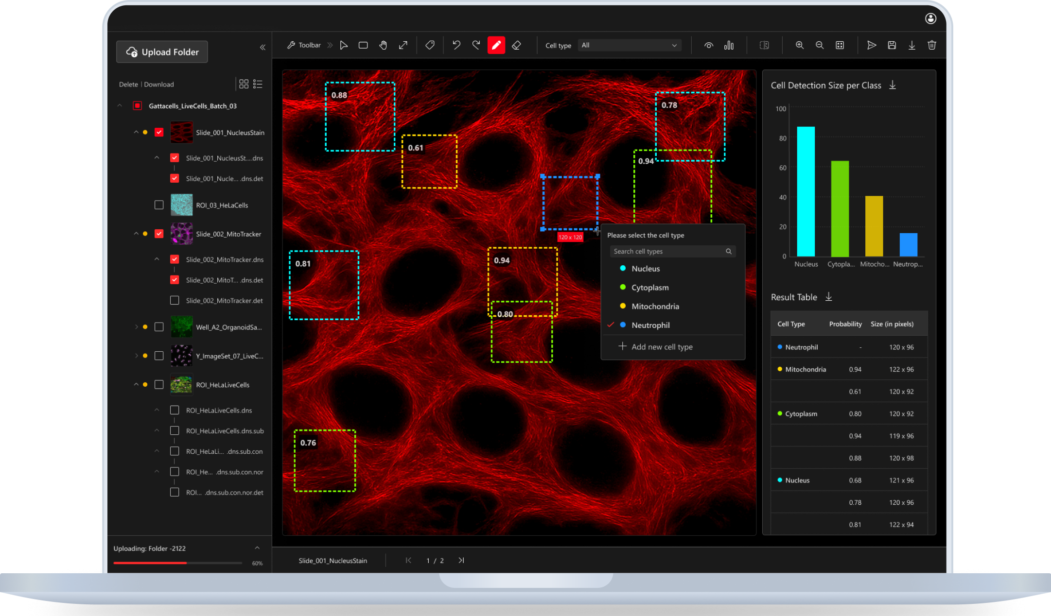
A digital tool for life science researchers to detect cells and tissues in microscopy images.
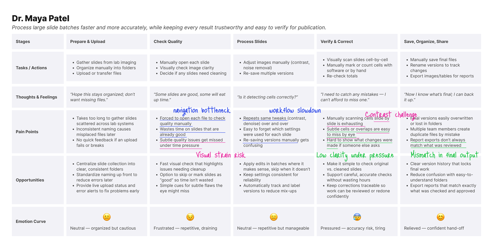
I used a simple loop—Research → Analysis → Pain Points → Interaction Design → Alignment → Solution that improved clarity and trust.


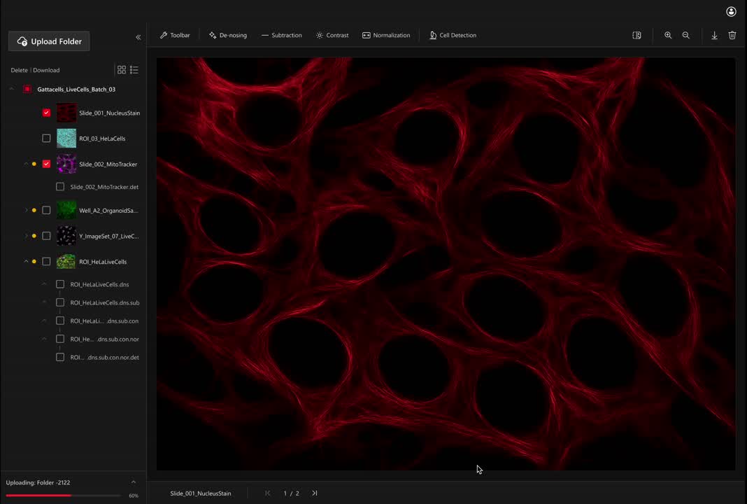
Main features
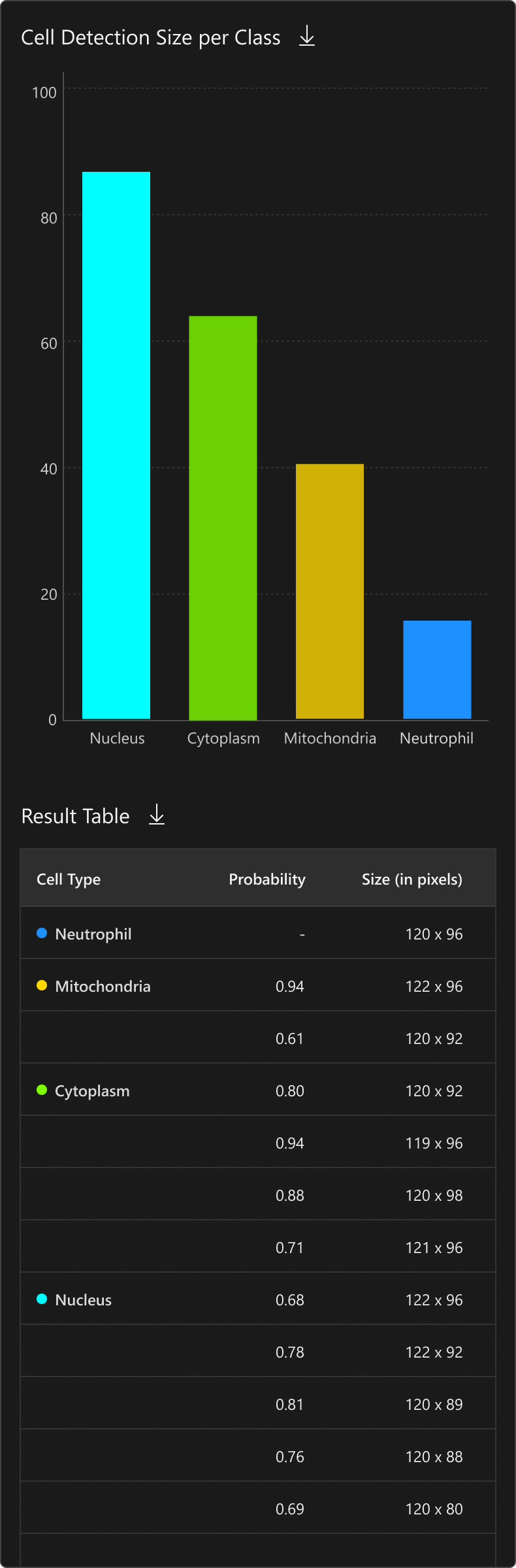
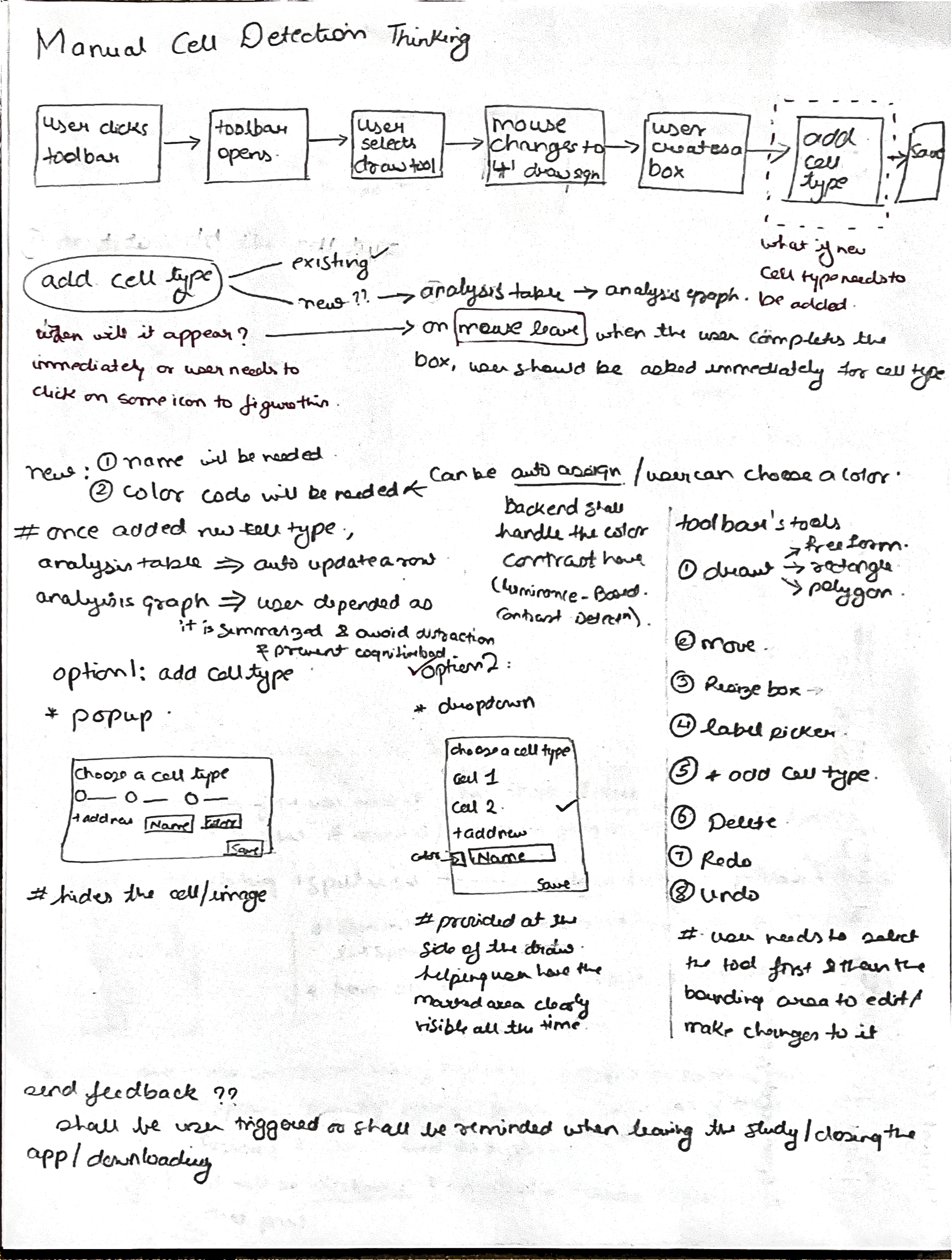
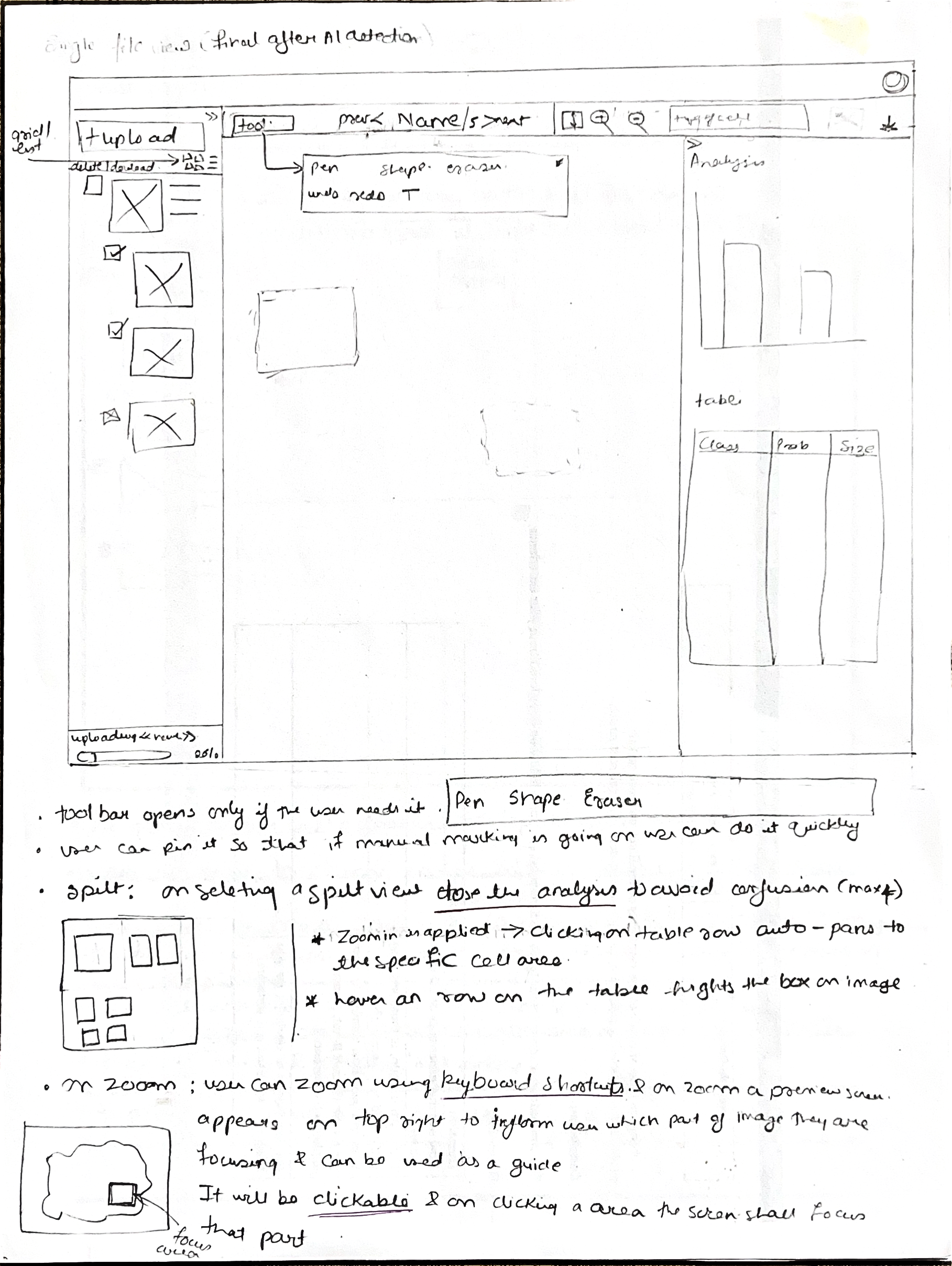
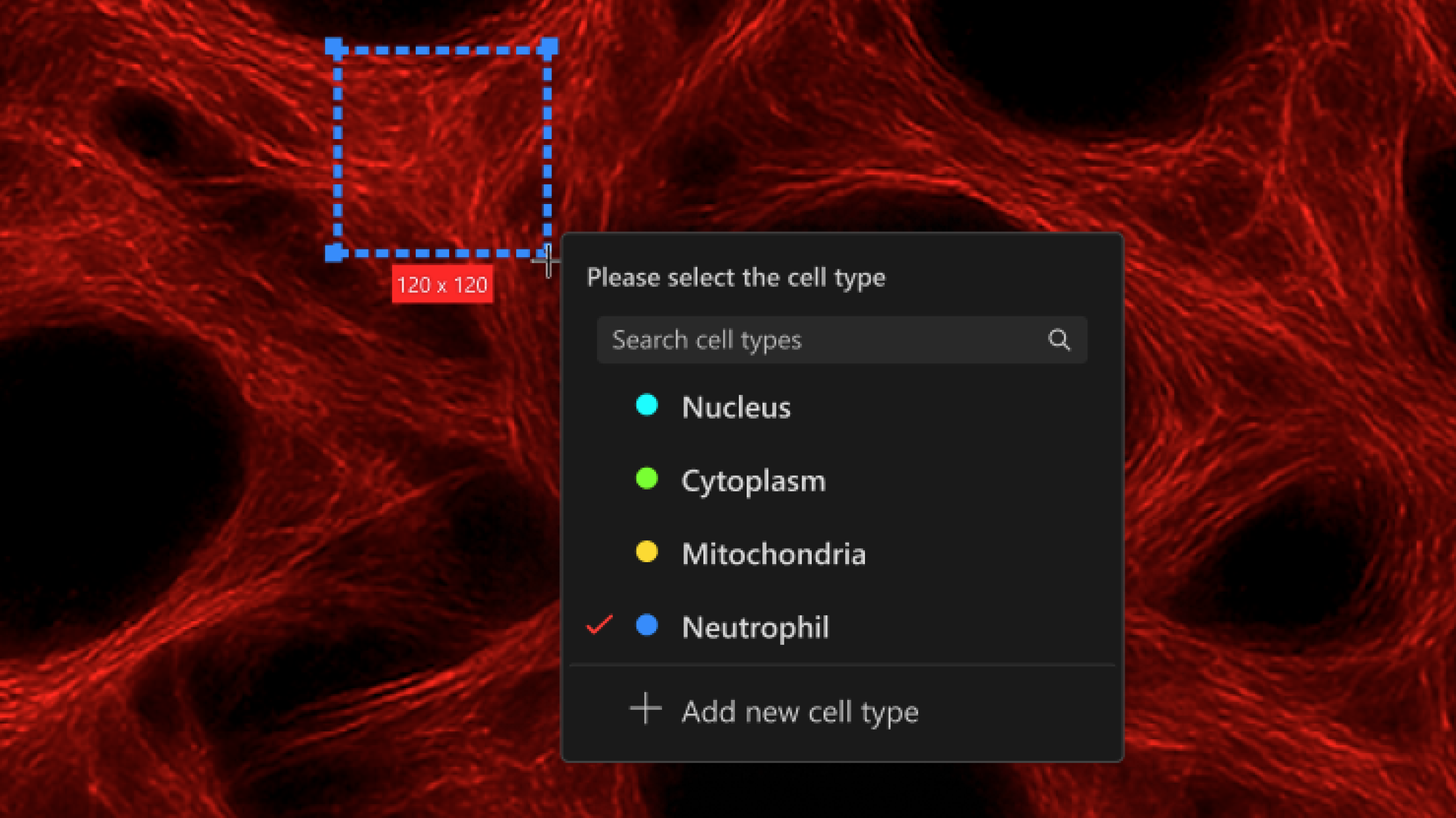
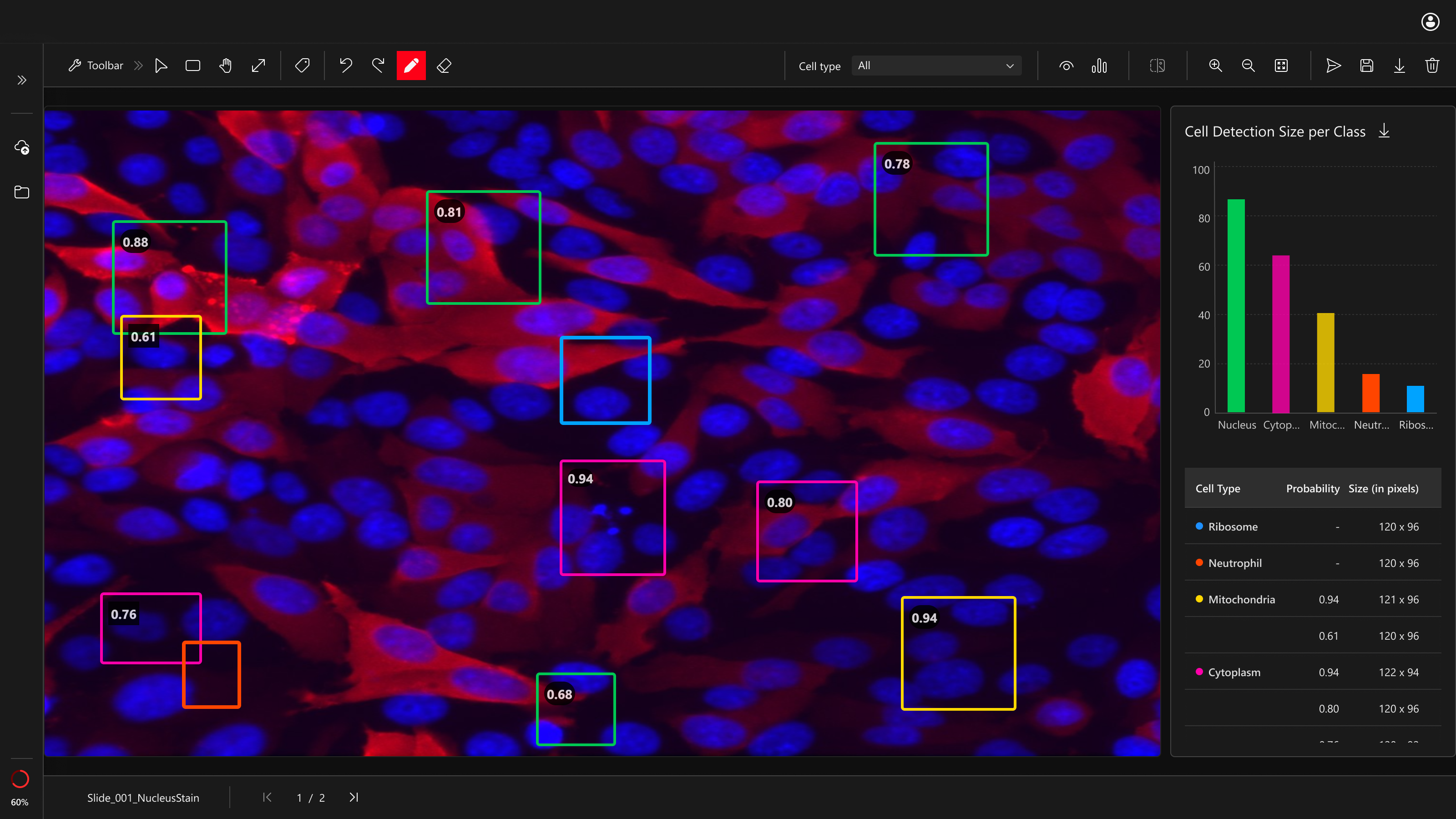
AI Detection
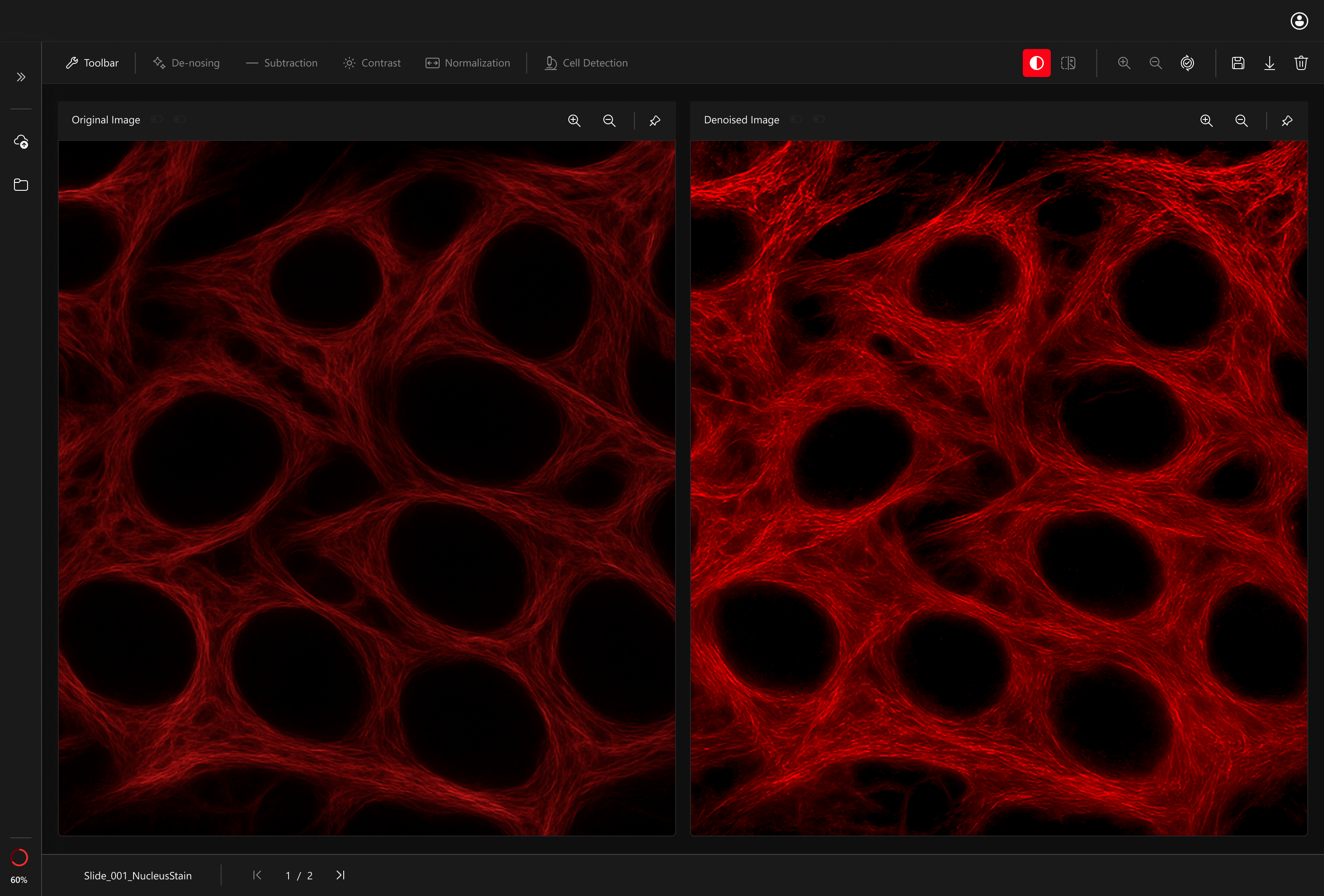
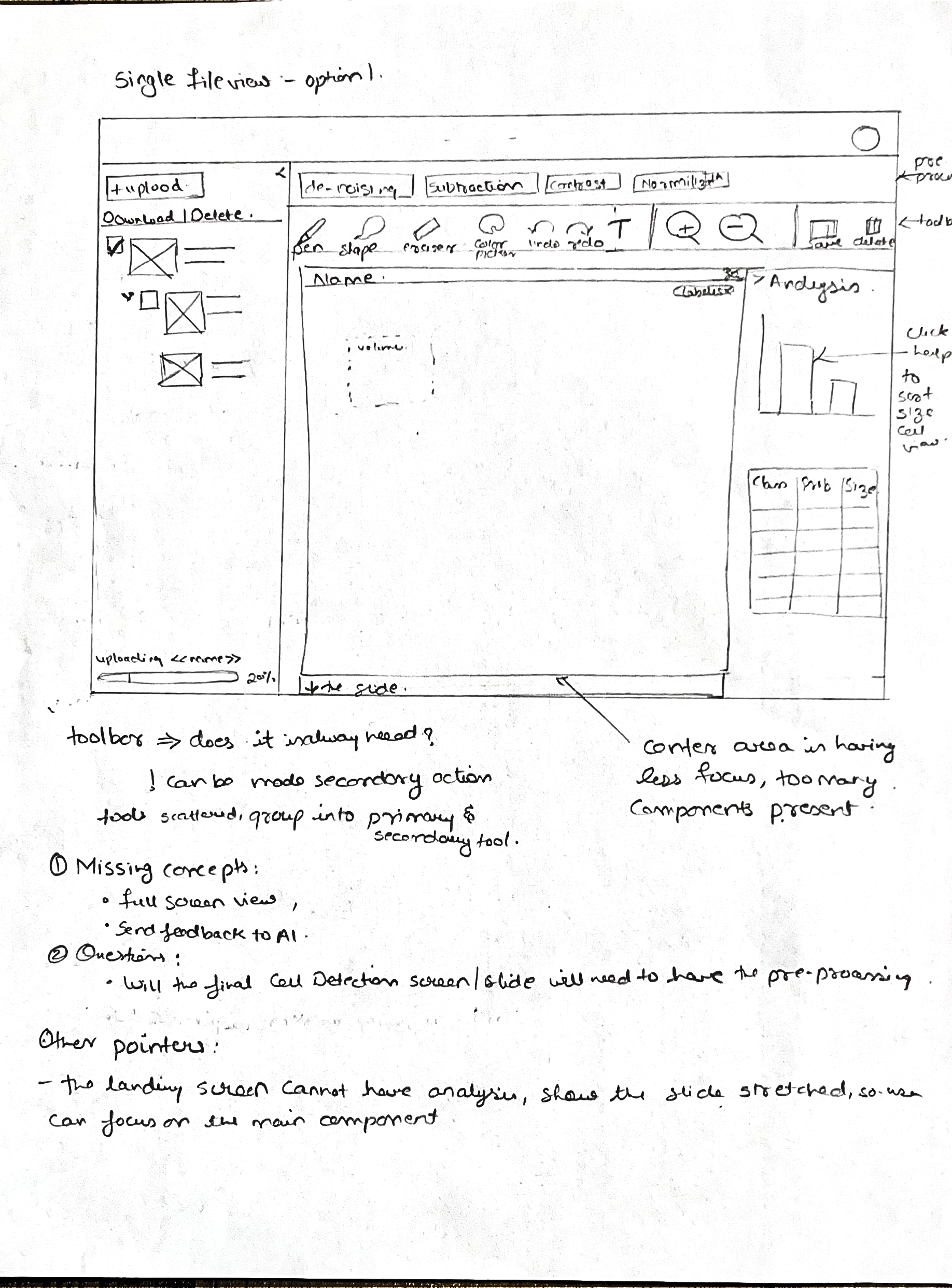
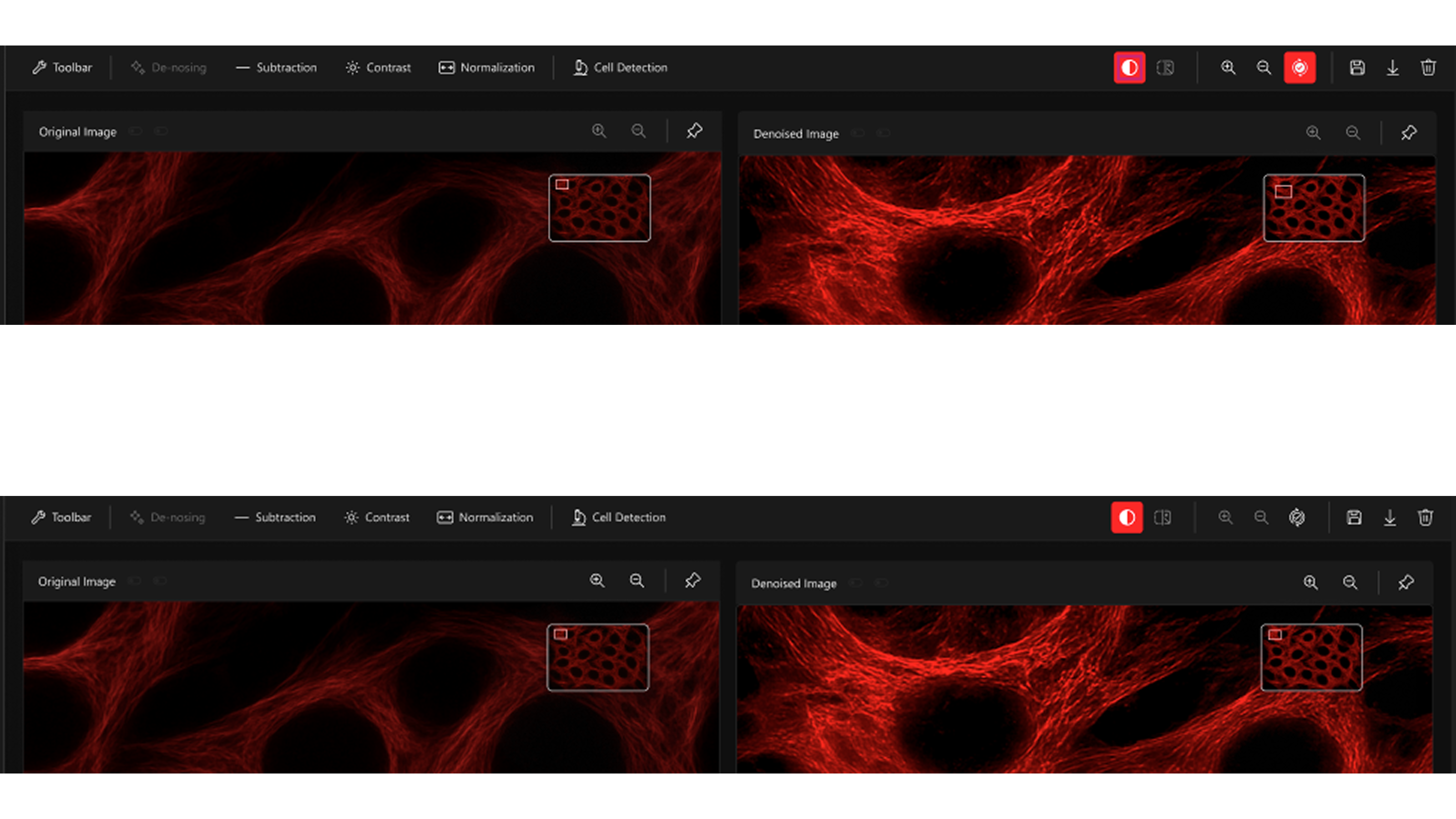
Split View
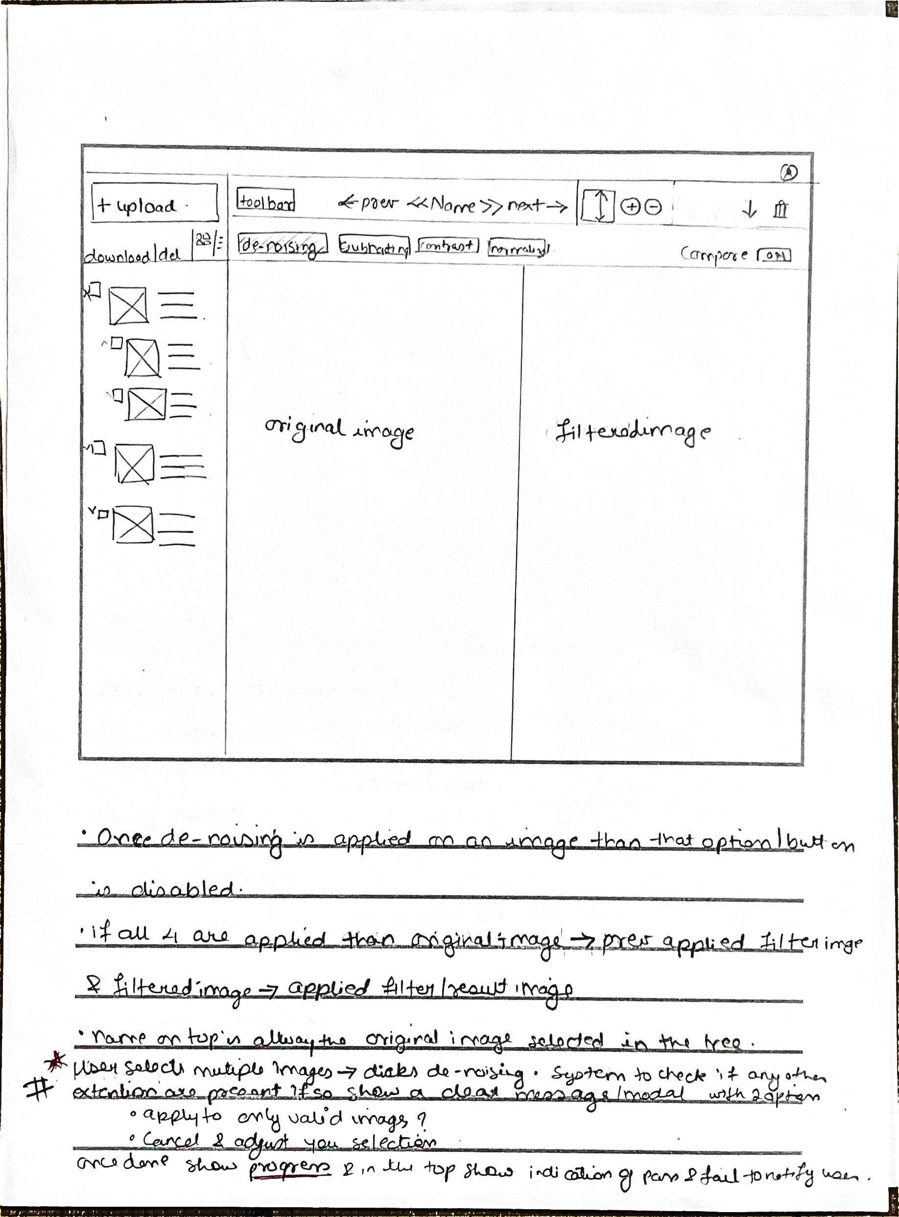
Comparison
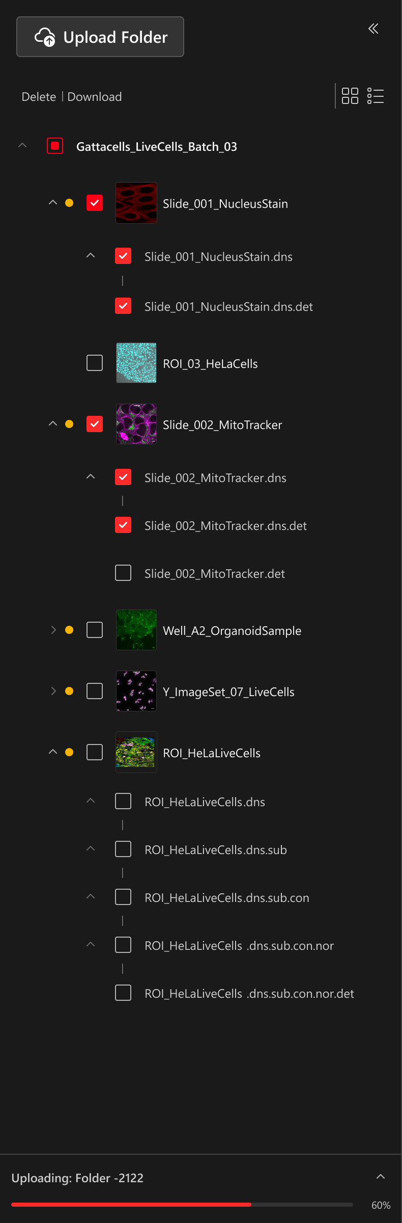
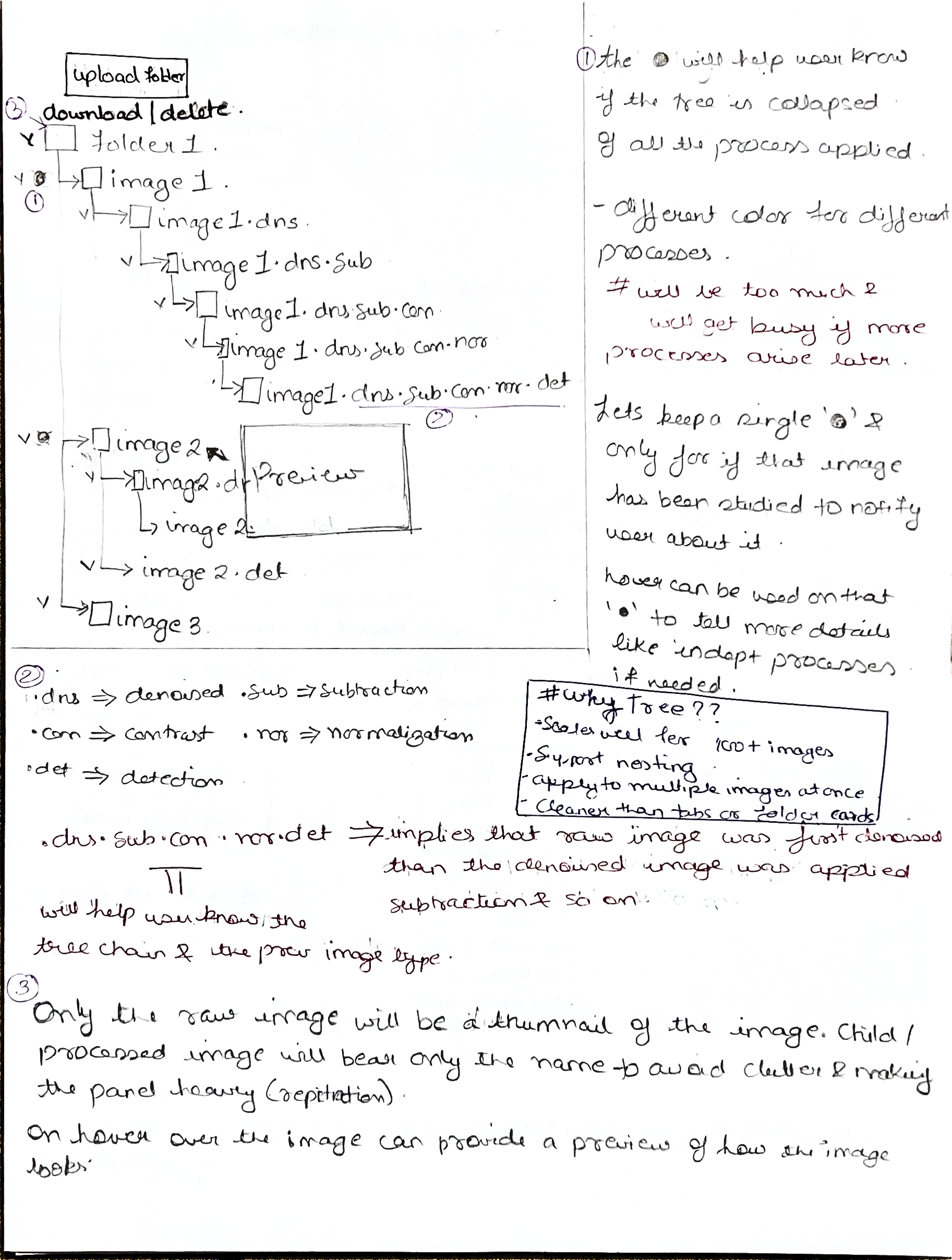
Image Library
Unified Review