The problem
A tool built for simplicity — suddenly asked to handle complexity
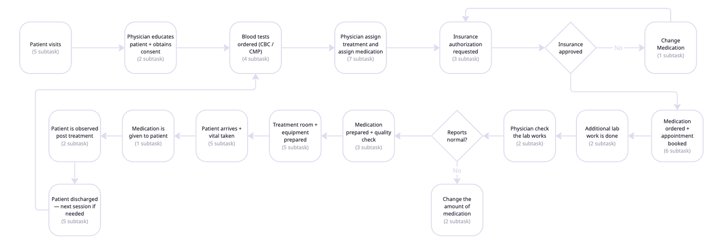
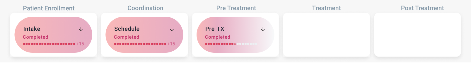
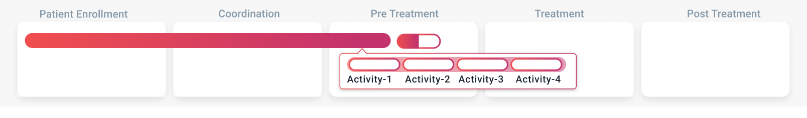
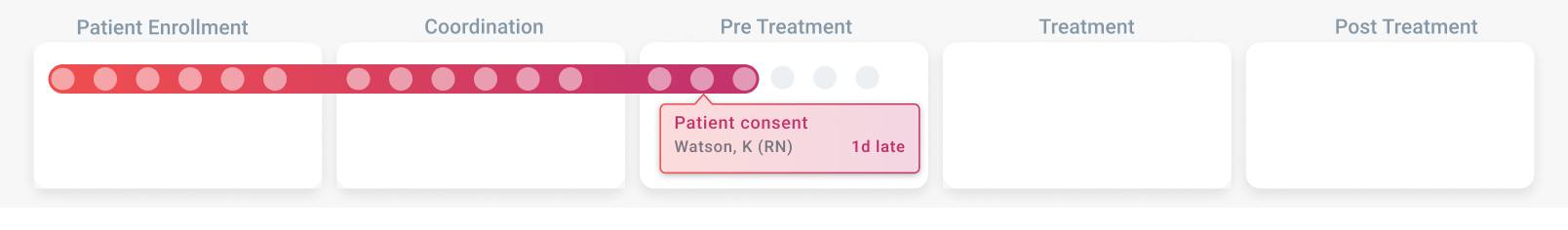
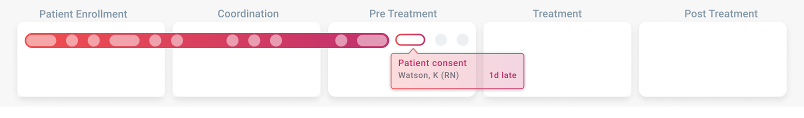
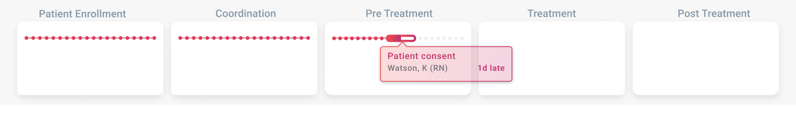
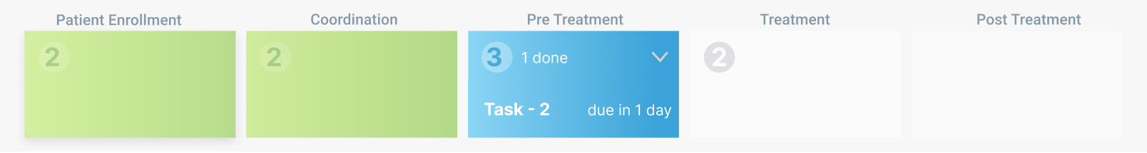
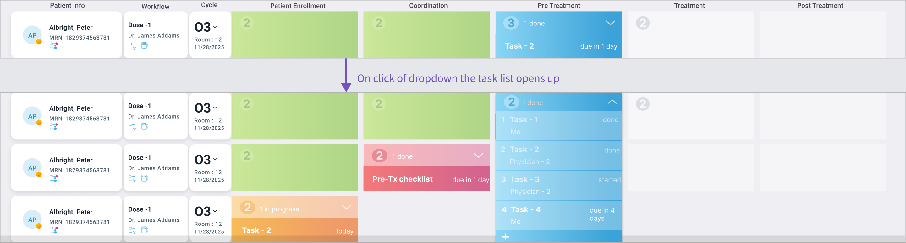
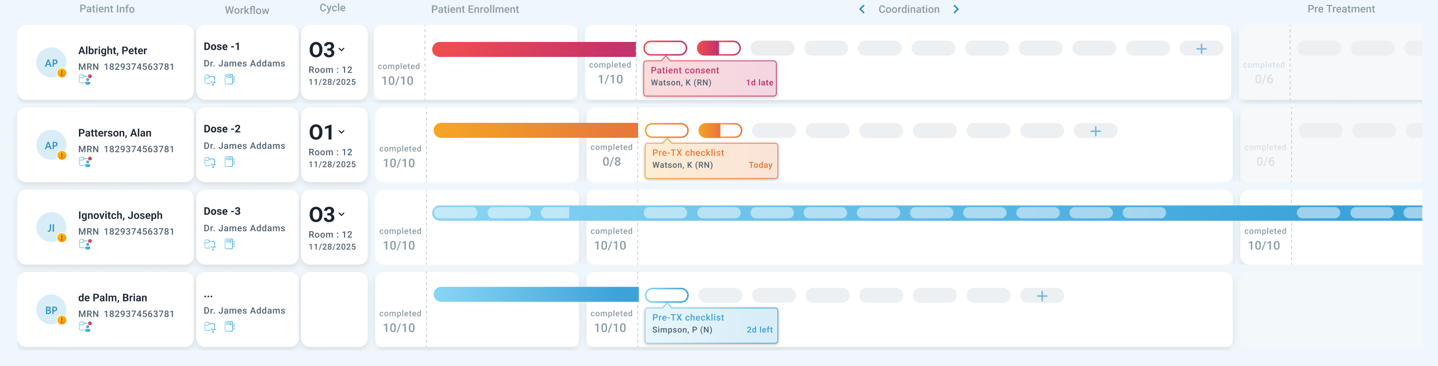
Think of this product like a shared task board used by an entire care team — physicians, nurses, coordinators — to manage every step of a patient's treatment. Each row is a patient. Each column is a phase of their care journey. The goal: anyone on the team should glance at the board and instantly know what's done, what's pending, and what urgently needs attention.
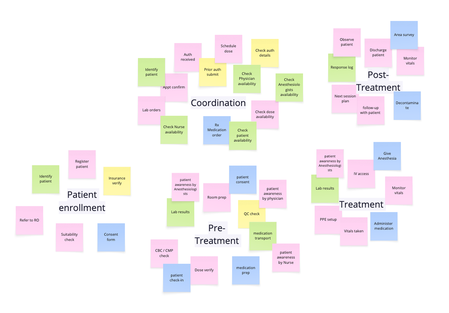
Originally built for one treatment type with a predictable ~13 tasks per patient, the board worked well. Then the product expanded to support a newer, more complex treatment type where patients had 40+ tasks — and every hospital's list looked different.
~13
tasks — original design
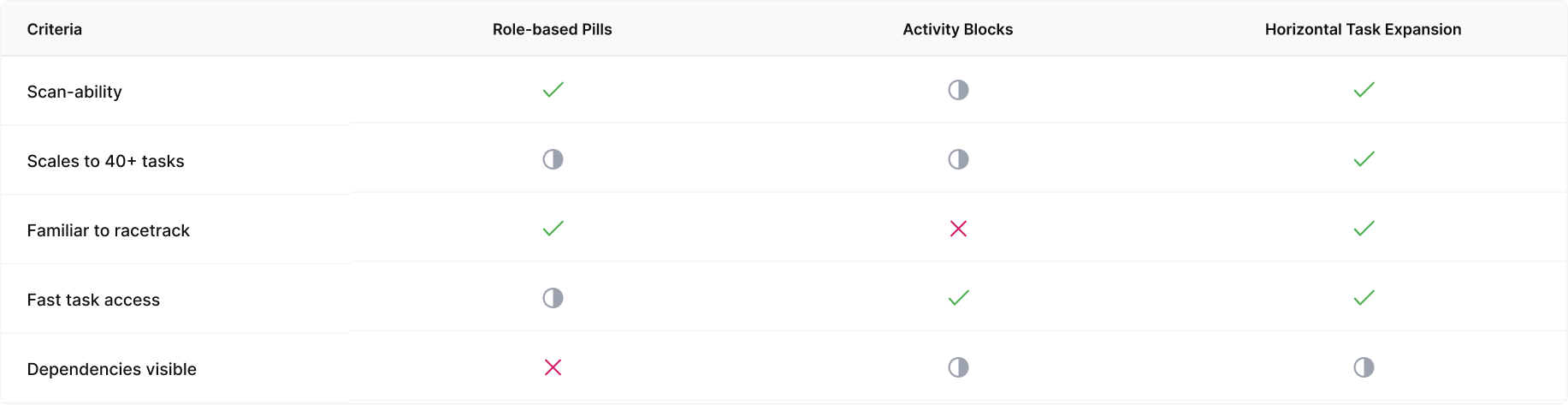
✓ Scan-friendly. Everything visible at a glance.
40+
tasks — new workflows
↑ Screen cluttered — scanning impossible
↑ No standard list — every hospital differed
Three things could not change
01
Scan speed
Physicians had to glance and know — adding more tasks couldn't slow that down
02
Familiar layout
Teams couldn't relearn a new system mid-work — the existing structure had to stay
03
Flexibility to scale
Must support 40+ tasks that varied from one hospital site to the next
The hardest constraint wasn't adding more — it was scaling without losing the mental model the team already depended on.